
Multiple layers
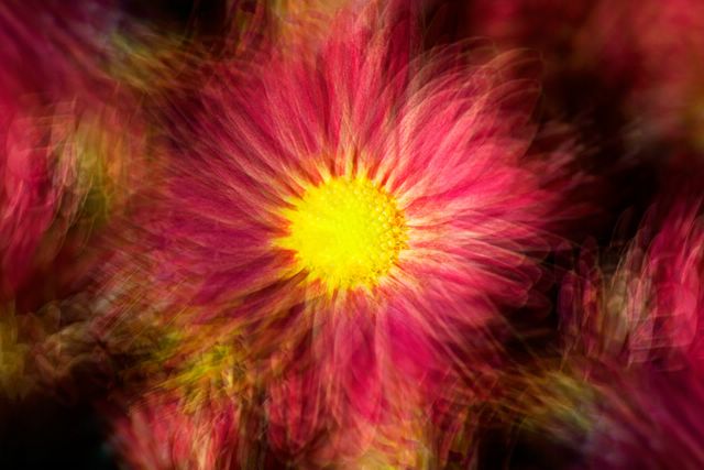
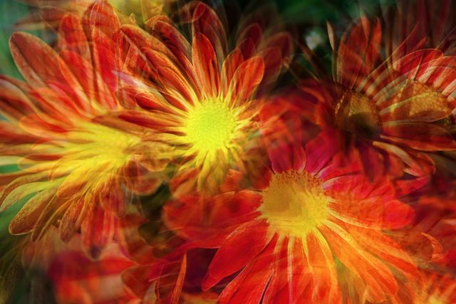
Chrysanthemums
 Changing the registration along the petals of the flower. Shot centered on the flower, then moved out to the 8 points of the compass for the other shots.
 This time I zoomed in towards one of flowers (the middle one) keeping it roughly the same place in each frame.
Plantpot
This time I zoomed in towards one of flowers (the middle one) keeping it roughly the same place in each frame.
Plantpot

 Shot handheld, while spinning the pinwheel in the wind.
Tried using the actions to build several multiple image shots. Found that the layering is a good starting point and that the action really speeds things along. Think I want to change it to work straight out of bridge though. Also thinking I might add options for different blending modes in to the starting set.
I notice that this seems to work really well on natural subjects (flowers etc). I'm not yet seeing good results with man-made objects. I think I need to try this on larger scenes though and see how it works in that context - maybe look at some more classic intimate landscape subjects and apply the techniques to those - though I'm already feeling that those are well covered impressionistic painting subjects - bridges, lily ponds and the like.
I wonder how this treatment would be on a portrait subject. Maybe that's my next direction - a series of headshots of a person expressing different emotions, all blended together. hmm...
Shot handheld, while spinning the pinwheel in the wind.
Tried using the actions to build several multiple image shots. Found that the layering is a good starting point and that the action really speeds things along. Think I want to change it to work straight out of bridge though. Also thinking I might add options for different blending modes in to the starting set.
I notice that this seems to work really well on natural subjects (flowers etc). I'm not yet seeing good results with man-made objects. I think I need to try this on larger scenes though and see how it works in that context - maybe look at some more classic intimate landscape subjects and apply the techniques to those - though I'm already feeling that those are well covered impressionistic painting subjects - bridges, lily ponds and the like.
I wonder how this treatment would be on a portrait subject. Maybe that's my next direction - a series of headshots of a person expressing different emotions, all blended together. hmm...


3 comments:
I love the pinwheel picture! It's just plain beautiful to look at. The totally white, blank background works very well here.
About the plantpot composite, I think the colours are great, all those beautiful bright colours on a blue with greyed out greens and yellows background. But I keep wishing that the picture were a 1.25:1 proportion (or close to that), with less information at the bottom, and with the pot a bit more towards the right hand side of the picture.
The second from the top picture is my favourite in this group. It just glows, and I love it.
The top image is also pretty, but, at least to me, it's too centered. It looks "anchored" and "shaky" at the same time, and that is a bit strange to my eyes. But that's just one person's opinion, OK?
It's interesting to note the differences between this blending method and some of the others that are being used here. This one gives more or less equal weight to all the pictures. John's method gives more weight to one picture, while the rest are complementing that one.
I am wondering - how do you keep the colours so bright and fresh while blending so many images? In general colours seem to get a bit more greyed out in multi-image blends.
Add my kudos to the pinwheel photo. It works very well! Colors are always key to this kind of work, IMHO. Maybe that's a challenge to do some with bland colors ;)
You have done quite well with these photos. The pinwheel is my favorite although I believe you are doing quite well on all of your shots to pull the textures out to the front of the image.
Post a Comment