Wednesday, April 30, 2008

sofobomo : covers again

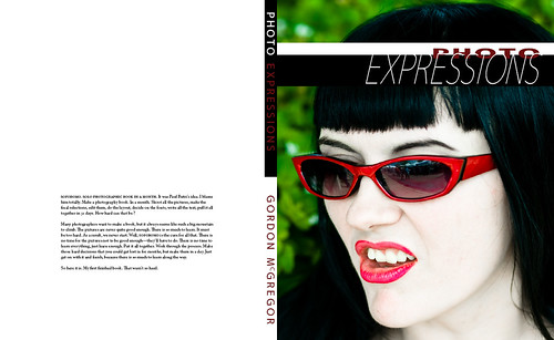
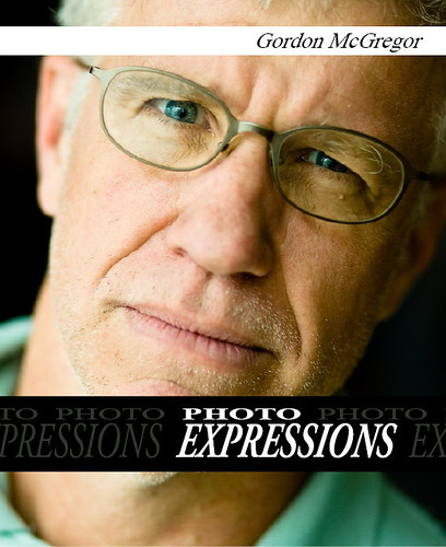
For those of you finishing up a SoFoBoMo book, cover design might be one of the last things you've been thinking about. If you are looking for ideas, Blurb's blog has an interesting entry and links to a variety of articles and sources of inspiration for cover design.

Where are they now ?

Where are they now ?

It is rare for me to have a fully formed idea for a photograph. Rarer still for me to wake up with it and have it stick in my head for several days. On Saturday morning I woke up with an image clear in my head. I'm trying to pay more attention to these few and far between moments, which is maybe why it has still stuck with me. I can still visualise it now - the composition, the lighting, how it all comes together. A mostly dark, blue motel room, a disheveled bed, maybe clothes scattered around. Not the seediest hotel in the world but not classy either. The bathroom door is open. Bathed in a yellow/green flourescent, tungsten light, a woman stands, naked, with her back to the camera. Long, dark hair cascades down her back. She seems to be brushing her teeth, arm raised. The only notable thing in the whole scene is she happens to have fish scales that start around her mid back and descend into a full tail that she seems to be standing upon. the concept - the little mermaid - where are they now. Fairytale characters brought forward to the present day. After all, they were going to live happily ever after and ever after is a long time, right up to the present day. Never much liked Disney, but I grew up with Hans Christian Anderson and the Brothers Grimm. With this concept, I keep thinking of new permutations - the princess from the princess and a pea, holed up in a medical bubble, too sensitive to handle this modern world. The little drummer boy, just back from his first tour in Iraq. Rumpelstiltskin mending clothes in the back room of a dry-cleaners. I can see that first shot so clearly. Then I start thinking of what's involved in realising it. Location scouting. Getting access. Casting a model. The makeup required to pull off a half convincing tail. Lighting. Maybe the tail doesn't have to look so real ? Perhaps it just needs to be hinted at or even a more obviously fake take would work. Maybe a use for the distortion of the lensbaby, to blend the less polished aspects of the shot.

Monday, April 28, 2008

Still alive

I'm still alive but mostly exhausted by the whole book process. I finally finished soft proofing all of the images for a Blurb version of the book. That took most of Saturday morning, to produce a new version of everything then relink to the soft proofed images. Got it laid out and uploaded to Blurb and a printed version should hopefully be arriving in the next week or so. I'm excited to see the finished version and perhaps more excited just to be done, for now. Other SoFoBoMoers are finishing up around now. I've seen several excellent results popping up. I particularly was taken by Paul Butzi's walk around his home with his dog. The words and pictures flowed together really well and there were a few good insights shared along the way. The other Paul, Paul Lester, also shared a beautiful look around a small glen, close to home. Getting to experience his Taoistic approach to arranging the images was a delight. Looking forward to seeing the other books as and when they arrive. I haven't taken a picture since the last SoFoBoMo shot. Almost have a couple of times but the urgency isn't there for now. I did wake up on Sunday morning with a fully fledged, fully visualised idea in my head that I'd love to follow through on. That hasn't happened before - I can really see the image in my mind's eye. All the details. How I'd like it to be lit, what the colours would be, how it would work. I know the story and what the concept is. It even has scope to be an entire other project - a series of conceptual images. But I'm daunted. Daunted by the thought of trying to put it together. Daunted by the work required to pull it off. Scared it might not be as good as it still is in my mind's eye. Unsure why I'd spend the money required to make it happen, with no general point to doing it. All sounds silly after I've typed it out. Mostly though, I just feel tired of the whole thing for now. I need to recharge. Another indication that that's true: I went to set up the camera to play around with some stroboscopic shooting and I've stripped the tripod thread. So no tripod shooting until I can get that repaired (anyone know what the cost is?). I'll take that as a sign to slow down for now and enjoy some other things. Reflecting on the whole SoFoBoMo effort - I'm amazed at how much I learned, in such a short period of time. Adobe InDesign from scratch, in a few days. The ins and outs of basic typography and layout, enough that I could at least understand all the mistakes I'd made when Holly pointed them out. Enough to have not made many more along the way. Insights I gleaned about how a book should be structured. The front pieces and how they relate. The application of graphic design and the torture of trying to come up with a passable design. The issues around layout of pages and display of images. The struggle to take enough images and then to have enough good ones. The always twisted writing process. How little I enjoy editing what I've written after the first draft. The great sense of shared purpose between all the people participating. The fun and excitement of sharing your book with someone for the first time. It certainly makes me want to do it all again, some time soon. I'm just not sure if I can face up to trying to do another one in May. Going to mull it over for a few more days.

Thursday, April 24, 2008

ankle

ankle

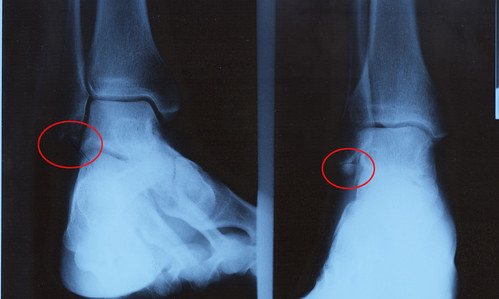
I think this bit is supposed to be attached. Explains why my foot has been sore.

Wednesday, April 23, 2008

SoFoBoMoFinito!

I'm finished! I suppose I have another week left if I wanted to use it, but it is done. The final edits have been reviewed and the PDF version (3.5Mb download) is available. I've also made it viewable here through Issuu in their flash viewer. I actually really like that presentation, particularly if you use the Fullscreen option in the menu bar of their browsing tool to remove all the stuff around the edges. Works well in Firefox, will be interested on feedback on that. I know some people dislike flash with a passion (please feel free to enjoy the pdf version!). I'm going to wait a few days and see if I get some feedback before starting the soft proofing process to make an actual book. Amanda was generous enough to read through it all and read it out loud to check how the text flowed. That was a fun experience. I've already had some feedback on potential issues with how some of the red on black text might not print successfully. Anyone have experience with that ? Any other feedback, comments or opinions are also very welcome on this, my first photography book! ETA: I've updated the two versions based on feedback from Holly Sisson. She was kind enough to look over the first version and find all of my typographical mistakes, giving me about three pages of corrections for the four pages of text that are in the book! I certainly appreciate her attention to detail and have adjusted the layout accordingly.

Tuesday, April 22, 2008

finish line in sight

2nd StreetI don't think I could take four times a year. I'm exhausted by just one attempt. Strung out, tired, burned out and ready to put my camera away for a few weeks. Or at least avoid shooting people for a while.
It has been quite surprisingly intense. I didn't think it would be this tough at the start. Portrait photography always does leave me tired, so I suppose that I shouldn't be too surprised to be exhausted after committing to a book of portraits in a month. It probably didn't help that I was struggling with man flu for the last 3 weeks either. Still, I've been surprised just how much really goes in to doing something like this, passably well. The shooting was only half the battle. Editing, finishing and laying out the pages took just as long. But the good news is - I finished the final layouts last night. It is done. All that is left is some proof reading and checking. I might still tweak some layout pieces and maybe get rid of one spread (I'm around 82 pages/sides - might drop it down to 80 sides, just to round it out). I still have a bit of work to do in creating the final PDF version and then also soft proofing and adjusting for a print version but that is all quite minor. I'm also playing around with using http://www.issuu.com for an online viewable book version. That will be yet another layout that needs to be done with a different number of pages. Then all that is left is the anxiety of showing it to people. Nobody has seen it yet. That changes this evening.

my favourite model...

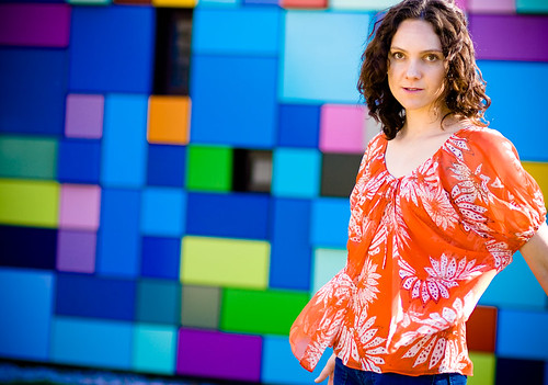
my favourite model...

more from Discovery Green

Monday, April 21, 2008

sofobomo : cover story

cover
I've got eight days left to wrap this thing up (that's what I get for starting a bit early I suppose). The drop dead date is next Tuesday but I think I'll have everything bundled together and finished by the weekend. I'm reading other blogs and suddenly remembering about the sequencing aspects of it - this last week I've just been focused on finishing shooting and then creating individual double page spreads. Haven't given any real thought to how those pairs of pages go together. The idea of chapters had drifted out of my head completely. I think I might have two broad sections to group the people into and that's about it. Shooting is done. InDesign template and page design is essentially done. Colin was talking about covers. I realised over the weekend that I probably need to do three versions of the cover. There's the general layout out of the front page to think about, but then there are different versions - the web version that will represent the book, that hopefully people will click upon. Then there's the front page for the PDF version. I have some 'dust jacket' text that I want to place there, at least it'll be on the back of the real book - but should it be on the 'back' of the pdf ? On the left of the cover in the way it would be printed and wrapped around the book ? It is something that really should be read before reading the rest of book - should it get a page to itself in the PDF layout, then move to the back page of the real printed edition ? Same with a bio blurb - it'll go on the inside flap of the dust jacket in the real book, but where does that live in a PDF rendition ? Then of course there is an argument to be made for changing the font size between the web and print version. 10pt at 300dpi is a very readable printed resolution. Bit tougher to read at 72dpi on a screen. 12pt at 72dpi is the standard readable screen resolution, but doesn't look anywhere near as good printed. Anyone got thoughts on this one ? None of these are particularly earth-shattering decisions, but they all add to the things to tweak and get right. The font one might be the most thorny if you are really being picky about the presentation.

Sunday, April 20, 2008

sofobomo : final shoot

Went to Houston this weekend, to catch up with Amanda's sister, Kate. We spent a fun afternoon taking some portraits in the new Discovery Green park in Houston - that Kate helped launch and did a lot of the PR work. Kate has been learning about photography since getting a SLR camera for Christmas and we spent a couple of hours trying to find good light and learning a bit about using reflectors and shadows on a bright, sunny day to make interesting portraits. It helps me when I try to teach someone because I have to break down and explain my own process. I learn a lot about it along the way when trying to explain it to someone else. Amanda was kind enough to be the model for most of the day, while Kate and I took her picture. I also managed to take a few shots of Kate, shown here, for the expressions project. These are the final set of portraits I'm taking for my SoFoBoMo book, so now all that is left is putting them all together. I've cropped these slightly differently to my normal approach, with a bit of a more cinematic feel than others. I find I really like this very wide and narrow aspect ratio. I might explore this a bit more in the coming weeks.

Friday, April 18, 2008

sofobomo way

sofobomo way

The editing continues. When I started this project, my biggest concern was getting enough pages. Finding enough people to even meet the basic requirements and having the 35 images. So I shot a lot and shot quickly. Now I have the reverse problem. Too many pages and certainly too many portraits. More than enough. So I have to start cutting back and editing the book down to the best images. I'm left with the small dilemma of cutting images of friends. Sorry you didn't make the cut I'm sure is going to get taken the wrong way by some. When I say the pictures aren't interesting enough, someone will hear I think you aren't good looking enough or various other misinterpretations. If the pictures aren't in the book, it will be because I didn't make an interesting enough picture. Honest! Some of the sessions went better than others. Some of the locations I picked were better than others, for lighting, for background. Other shoots I just plain screwed up because I was working quickly or just nervous about the whole thing. Most of the time I spent no more than a few minutes with each subject. I'm used to getting maybe one usable image out of that sort of session and not trying to extract half a dozen or more. I am taking on board Julia's comment about too many pictures distracting from each individual image and for some pages, keeping things very simple. For others, all of the shots will be on display - again, trying to mix it up and keep it interesting. Still showing different expressions for each subject, even if the number of shots varies dramatically. That's the beauty of shooting landscapes or macros, they don't get offended so easily.

Thursday, April 17, 2008

SoFoBoMoPinHo : ideas for the second book

Corbis have just released a set of make-your-self, print out and assemble pinhole cameras. I'm considering using one for the second book, as I've got a pile of film around the house I'm probably not likely to use for anything else.
A second option is evolving around the idea of losing focus and exploring making images that are not perfectly, or even at all, in focus. I keep flirting with this idea but haven't really made much in roads. Perhaps committing to it for a month would help me explore a bit deeper. I do feel burned out on shooting portraits, for now. I think I might find an area of shooting that is a bit more restful and contemplative. It has been fun shooting all these people but the interaction is wearing me out. Building up to asking people, dealing with occasional rejection, being sociable. Time to shift gears and find a slower subject to help me recharge.

sofobomo : more layouts

I'm finding this part of the project the most painful. The shooting was a lot of fun, but now the editing and assembly is starting to drag. The images are mostly edited down and finished, so I've gotten over the hump of that. All I have to do is put them together in some sort of coherent and stylishly designed way. Or maybe just coherent and designed.
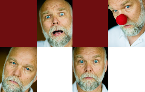
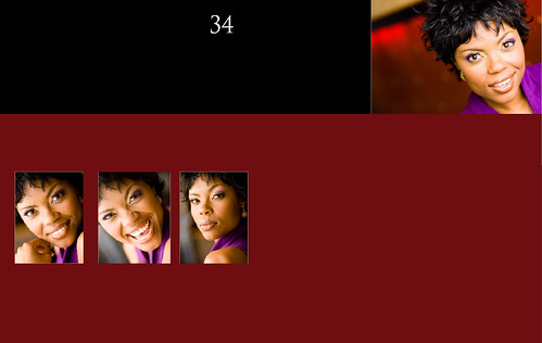
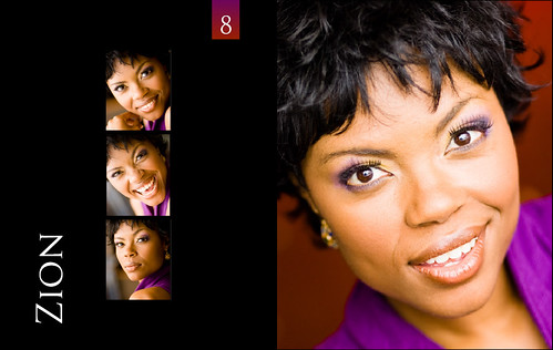
Hmm. This is all new. Anyway, here are some more sample layouts that I put together last night. Feedback as always is very welcome. With the realisation that each page doesn't need to be the same as long as they are somewhat related and consistent, the layout design became a much bigger issue than just dropping pictures on the page. Mostly that came from the understanding that just having the exact same layout and number of images on each page would be really boring. As I shot, I also found that some people were more expressive and willing to act up, giving me more material than others. Consequently, some pages deserve more images than others.
Both of those decisions increase the thought that goes into each page - how to lay it out, how many pictures to use, how to size them and so on. I'm trying to just let it flow and keep some design elements to pull it all together - the deep red blocks, white space. Making slow progress with this.

Tuesday, April 15, 2008

art is a verb

art is a verb

Paul Lester picked up on a comment I made over on AJesse's blog, in the comments on this blog post. Anita was mourning the loss of images, when she had suffered a double disk failure. I was reminded about an idea I'd had a few months ago, as an exercise in enjoying the process, rather than the end results. I had wondered if it would be interesting to go and shoot, to the best of your ability, to be fully engaged in the process, then just format the cards without looking at the results.
I originally had the idea after a morning shooting at Tybee Island. I talk about that shoot here. Somewhere in the back of my head was also the notion of art is a verb that Paul Butzi has written about. Paul himself doesn't suggest such an extreme position, but it might be a logical conclusion to draw. If the process can be just as important as the end product, do we always need the product ? Can you just let go and enjoy making the pictures ? Let go of the results ? Shooting at Tybee was liberating - I felt euphoric, running in and out of the ocean. My camera had connected me to that place and the experience was wonderful. I wouldn't have had the experience if I hadn't been fully engaged in making those pictures. But did I need to see the resulting images ? Would I be content with just the memories ? I think I would be. Just never quite had the nerve to try. I'm sure many of you think this is a crazy idea. Think that photography is all about creating the final image. But on occasions, I just get so caught up in enjoying making the pictures that I'm not sure I need to see the payoff at the end. Or experience the disappointment when they don't live up to what I thought they might be. Children can get a lot of mileage out of playing with an empty camera. I find play to be a big part of when I really enjoy photography. But, as adults, we are always so focused on the final image. Now, I'm not suggesting you should do this. I'm certainly not advocating doing it all the time. But maybe, occasionally, thinking about enjoying the journey might be as valuable as looking forward to the destination. If you try it let me know. If I ever get around to trying it, I'll let you know!

Monday, April 14, 2008

too many choices

Feeling a bit daunted right now. Shot several more people for SoFoBoMo over the weekend. Only really have 3 or 4 more planned shoots left. Essentially the taking pictures part is done. The playing around working out layouts is done. I just pulled all the possible candidate shots up in Lightroom. These are the ones left, after the obvious rejects have been thrown away. 342 images. Somehow I need to weed that down to final selects for the book. Seems like a big hill to climb.
But I suppose I get there, just like everything else, one picture at a time. Time to start trimming things down to a more manageable level. The hard part is mostly behind me, it is just about finishing now. ETA: About 4 hours later, I'm down to 193 images that are mostly finished. Getting there!

Sunday, April 13, 2008

happy hour

RSVP to http://www.etcmisc.com/

Saturday, April 12, 2008

sofobomo two weeks in

sofobomo two weeks in

Another day of shooting for SoFoBoMo. Several very helpful and generous people made for a fun day. I went to the Austin Art City art fair and used that as a way in to talking to the people selling their art.

Several interesting people there, who were willing to participate in the project. Only one rejection - from a natural light, traveling portrait photographer who spends all his time working with strangers, naturally. I'm handling the rejection better these days, just move along :) Erin and Phil also agreed to participate and hammed it up magnificently.

I'm two weeks in to my SoFoBoMo month. Most of the pictures have been taken - I have a few people to talk to tomorrow and another 3 or 4 shoots set up for the rest of the week and then I'm done. Well, done with the shooting part. Now comes the editing part.

My brain has already left the station, off thinking about the next book project and then the other book project after that. Also trying to start up a Strobist beginners group to learn some fundamentals of lighting, to help lift us up for the next larger group get together. Always my problem. I love starting things. I love doing the 80% of projects. I need to work on my ability to knock out the last 20% and finish them. But SoFoBoMo will be finished. Another couple of weeks to go!

In other news, I got feedback on my ankle MRI. When I sprained it the ligament apparently pulled a large piece of bone off which is floating around in the joint. That'll explain why running hasn't been much fun for 6 months.

Wednesday, April 09, 2008

cow creek

cow creek

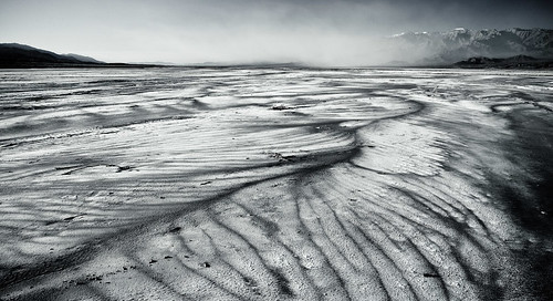
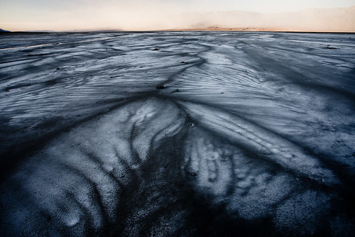
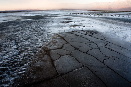
A break from the constant barrage of SoFoBoMo posts. I spent a bit of time this evening looking through the final day of shooting that I did in Death Valley. I'd woken up early that morning, with a vague plan to go back to the sand dunes near Stove Pipe Wells for a final sand shoot. I'd met a few people that I was going to shoot with and we all got together at 4:30am. The wind was howling. But they were all feeling hardy and still wanted to head to the dunes. So I wished them luck!
Instead I went with another group down towards the salt flats near Cow creek. I'd scouted that area on the Saturday when I'd arrived and found some really beautiful fan shapes in the salt. I'd walked out without my camera, towards the center of the valley on that first day, just to get away from everything and listen to the wind. The water and wind had blown rivulets into the salt pan and the shapes were achingly delicate. I'd hoped to come back when the light was good and marked some GPS co-ordinates so I could find it easily.
So on the last morning, I got my chance to go back and it was breathtaking all over again. Such graceful sweeping patterns leading off to the far mountains. The sand from the Stove Pipe Wells dune fields was filling the air in the distance, blowing down the valley and obscuring the hills but maybe adding some interesting mystery to the scene, too. The wind was whipping around my ears and it was a joy just to be up and out there to experience it.

sofobomolimbo

The layout is mostly done. I kept it simple, a 6x6 underlying grid and then tried to align most of the elements to that in something of a consistent way. I like how it looks for now. The fonts are mostly settled. The text is written. A big chunk of the photos have been taken. Now all I have to do is start editing them, pick them, finish them off and start pulling it all together. One consideration I haven't quite got to grips with yet is when to do colour proofing and adjustment if I plan on doing blurb output. Do I lay out the images on the pages and then proof the entire page, or proof each image individually and then re-embed them. Any thoughts ? I can see that doing the images on their own will lead to more work and probably better results. If I embed them I run the risk of tweaking the colour for layout elements as well, so each page would be subtly or not so subtly different which will probably look bad. But if I do each image on its own, I'll basically have to lay the whole thing out twice. That doesn't seem right, either. (Once for a web ready, web proofed version and one as a print ready, soft proofed version). Must be missing something, I hope. Other than that, I'm feeling a bit blah. Got a cold or similar and can't seem to shake it. Isn't making me want to get out and shoot too much. Still, plenty of time! That and we finally filed our taxes for the year. Woohoo!

new and improved

Tweaked the SoFoBoMo pipe filtering a bit so that it should be more forgiving about letting relevant posts appear in the feed. If your posts are still not appearing, let me know and I'll see what I can do about it.

Tuesday, April 08, 2008

sofobomotypo II

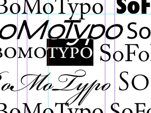
Font choices. So many choices. TrueType fonts, OpenType fonts, thick, thin, serif, san serif, slab serif, modern, old style, readable, legible. I was starting to get into that spiral of not being able to make a decision. The whole thing about SoFoBoMo is that there really isn't time for that. So I knocked together some samples and came up with something that I like. I knew I wanted to move away a bit from the tired, overused, built-in fonts. Didn't want to use Times New Roman. Didn't want to use Arial. Helvetica seems a bit played out and maybe tricky to work with. Comic Sans was calling... I found a few good resources for free fonts, online. Smashing magazine had a great list of 40 free fonts and I picked up several of them. Lots of good options out there. District Thin is attractive and clean. Anivers is lovely, as is Diavlo. I really like Museo but particularly wanted the light and heavy weights which aren't available for free. I downloaded a few of these, made up some sample pages and printed them out. It was much easier making the final choices from hard copy samples. They looked quite different on the screen and the font sizes made more sense printed. I ended up picking M+ Outline, which is also used for the new logo font at the top of this page. I've tried to keep things simple, one serif body font, one sans serif font for titles, in different weights and colours to create some contrast, while repeating the same letter shapes. I'm moving on from Typography now...

Monday, April 07, 2008

one week in

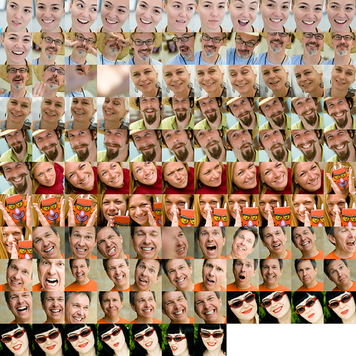
To keep Paul company, here are the shots that I've produced for SoFoBoMo in the first week, after a first pass to throw out the ones that aren't anything to do with the book. Other than taking the pictures, I've written three text pieces and worked out a lot of the general style and fonts of the final book. More detailed layouts is the next step, along with editing and finishing some of these shots. Technically, the collage is put together by getting Lightroom to spit out 200x200 pixel thumbnails then I used Picassa to create the contact sheet. There's probably a more direct way of doing this, but it works (and duplicates a few pictures of Amanda at the start and end for good measure)

Sunday, April 06, 2008

sofobomo : It's easier when they ask you first...

Was out walking around South Congress this Sunday afternoon, shooting some portraits for my book. Happened across the people doing the I am art project and they asked me to be part of it. I said 'sure' if they'd let me take their pictures for my project. That worked out well! Thanks to Jackie, Anna and Cybil for being part of Expressions.

sofobomotypo

I've been learning a bit about typography and layout for SoFoBoMo. There's so much to take in! Over the weekend I read the Non-Designer's Type Book by Robin Williams. The biggest crisis of choice I'm being faced with is the vast variety of fonts I can choose from. I think I'll just have to pick a couple and get on with it. The basics are simple, sans serif for titles and better legibility, serif fonts for larger blocks of text that need to be readable. But there are so many choices! Then there is all the more subtle details; using old-style numbers, kerning, small caps, ligatures, appropriate em dashes and quotes. Adjusting the paragraph and font alignment, hanging punctuation. The way a serif font letter 'a' changes to an enclosed 'a' in the italic version, but the san serif 'a' doesn't change for an italic serif font'a', just slanted. Many of the features that differentiate a layout tool from a word processor. Details that I was never aware of before, but now I see everywhere as I read. This sort of selective revelation has always fascinated me. Growing up I'd never seen a sun dog. Never even knew what one was. It wasn't through lack of opportunity- I spent a lot of time watching clouds float by. A few years ago I read a book about atmosphere and effects. It mentioned sun dogs and I thought they must be some sort of rare, hardly ever seen event. Amazingly, the day after I read the book, I saw one. Then I started seeing them every few weeks. They'd always been there - I just didn't even know to look for them, so I couldn't see them. I think this happens with photography too. Until I was aware enough of sharpening halos and other sharpening side-effects, I couldn't even see them to tell if they were right or wrong. I can look back at early pictures that I thought looked perfectly fine and now see all the issues. I couldn't even see those problems at the time I made them - I wasn't aware. But once you become sensitive to them and aware, then you can start improving on those features. The awareness is the key. The use of rhythm in composition, or layering or other compositional ideas is similar. Before I knew to look for it, I might know an image was more compelling, but couldn't divine why. Once you have the language and awareness to go look for the features, then you can understand what is going on. Only then can you start intentionally using it in your own composition. I now have a much better awareness of typography, that I didn't have before. Hopefully I can apply it to my SoFoBoMo book!

Saturday, April 05, 2008

sofobomo equpiment

sofobomo equpiment
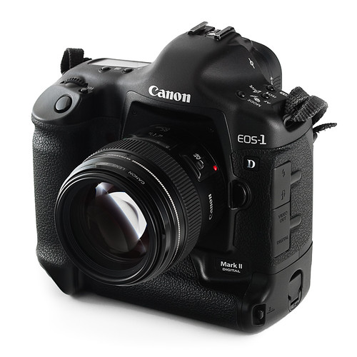
My SoFoBoMo plan involves using just my usual camera and usual lens. Canon 1d mk II, with a Canon 85mm f1.8. Here it is. I'll probably use it with a lens hood on, more often than not, but it doesn't look so good that way. Shot with a couple of Canon flashes (420EX and 580EX) triggered with an ST-E2 remote trigger.

the face of da vinci

I keep finding interesting, short videos. Here's another one, with a portrait and self-portrait theme.

Friday, April 04, 2008

what is art ?

Fantastic. I think that settles everything.

Thursday, April 03, 2008

sofobomo : I've never looked at a book before

I only realised this this evening after some time spent looking at a stack of photography books as objects. For the first time I was looking at them as pieces of design, rather than an invisible means to transport the content. Typically I look at what it is in a book, or read the contents of the book. I've never before paid much attention to how that was all put together. Almost all of my photography books have three title pages. The first page is usually blank, typically a binding page of some sort of heavier card, coloured to key off of the rest of the book design. Then there is a plain title page. Just the book's title, set in whatever font is being used to thematically hold the book together. Not usually anything fancy, stark. Lots of empty space. The next page typically repeats the title and adds the photographer's name and other credits. Maybe the author of the included essay is mentioned. Sometimes this page has the copyright and Library of Congress information on the facing page. Other times there might be a blank page. Maybe a dedication. Typically, that dedication gets placed on the next page, again out on its own. Must be important that bit, to get all that space and attention. Then we are off, into the book proper. There might well be an introductory essay, explaining the point of the whole thing you've got in your hands, then the pictures follow. At the end, we might start getting into technical info about the book. Perhaps a colophon provides insight into the typesetting and other design aspects and then we are done. The inside of the cover typically also has some blurb about the purpose of the book in the front flap, which occasionally bleeds over to the rear flap. Otherwise that rear flap is where the biographical information lives. A picture of the photographer. A potted history of the main creator, then in to any other authors, editors or contributers. Beyond that there is typography. What font to use. How to relate them to the content and to each other. How white space is used, what text is combined with the images. Graphic elements within each page. How to number pages. How to title images. Should there be any clues to what's going on or how it was done ? Lots of decisions to make. My only goal is that by the end it shouldn't look as if I did it all in MS Powerpoint, unlike my previous three attempts.

sofobomo layout evolution

Some evolution of the original ideas. Not convinced about the placement of my name on the cover yet. Inspiration struck when I realised that all of the interior pages don't have to be laid out exactly the same way. Something of a D'oh moment, that one.
I also decided to pick a single colour to use for some graphic elements in the page layouts and throughout the book. Fonts still need some attention - they haven't had any yet. Oh and the pictures of course, too! I know these are all the same photos over and over again - I'm trying to keep some of the shots as a surprise, so all the images are just placeholders for now.
Did work out the export settings to form a web PDF of the book and it is looking okay. The spread vs pages options in InDesign export help hold things together in a pdf with two pages per page, or single pages.

Wednesday, April 02, 2008

post-it design

My first fumbling explorations for SoFoBoMo with InDesign yesterday evening left me with some idea on how to use that tool, but with no idea on what I really want to lay out. I've got a vague grasp of the nuts and bolts of how to put whatever it is together, but no idea on what it is at all. Currently I'm at the scribbling on post-it notes for ideas stage, trying to brainstorm layouts - the one above is a potential cover idea. After a bit of twiddling around in InDesign I produced a first pass at the front cover. The next step I think is to start trawling through photo books in my collection to get ideas and layout pieces for inspiration/ all out theft. I've worked through most of the sizing and export sort of concerns so I know how to get a book together in PDF form and out to blurb. I've also tried a few permutations for the interior page layout. Haven't really got to grips with what all the pages are around the main content and what the front and back pieces of a book should contain or even look like. Then of course there is the issue of writing some content for an introductory essay, to at least set the scene. Oh, and of course, the pictures to take. That whole month is stretching out in front of me! Plenty of time I'm sure. Suggestions for improvement, feedback, modifications and comments are really welcome for these - I'm making it up as I go along right now...

design cues

want contemporary clean modern simple crisp colourful full bleed right justified bold
not black and white edgy funky grunge jarring classic elegant fussy twee framed detailed centered Times

lightroom beta 2.0

Adobe just released the 2.0 beta of Lightroom, for a 5 month beta period, ending in August. I downloaded a copy this morning and took it for a spin. The new excitement is the local retouching features, that enable localised exposure, clarity, saturation and tint adjustments to be made to an image. You can paint and adjust masks, blend and modify the amount of the effects and generally do a large amount of the work you might have done in the past in Photoshop with layers. This isn't letting you cut and paste parts of the image around, but will meet most of the dodge and burn or localised colour adjustment requirements. Looks like it might be useful. The next, potentially useful, feature is second monitor support. From playing around with it, it currently doesn't really fit the bill for me. I'd love to be able to work on a full screen version of the shot, with all the various tools and panels pulled over onto the second screen. This isn't yet possible - you can have a full screen preview of the working image, but you can't actually be working on it directly. So currently all it seems to be worth using for is a big finder. Hopefully this will change in later versions. I also note that vignettes has been extended to allow post crop vignetting - nice if you tend to make images in non 3:2 ratios and want to focus attention towards the center. Overall, the whole experience was a bit snappier and generally quicker. Import seemed faster and the preview creation was a secondary set of operations, running in the background without really getting in the way. Worth a look.

indesign

Squeezed in another couple of shoots today for my project. Now have 76 final selects for the book. Slowly realising that that's quite a lot of images to finish. Still got several prime candidates in mind to contribute to the book too. Spent some time this evening working through Adobe InDesign CS3 Classroom in a Book to learn the basics of InDesign operation. Seems quite similar to the rest of the Creative Suite tools and whole lot less painful than I remember FrameMaker being, which is a good sign. Also found a set of InDesign templates for the various Blurb.com books. I plan on using one of these for the layout of my SoFoBoMo book so that I can potentially target a final hard copy via blurb.com. Just downloaded those and will dive in to working out a template and page design soon. Also useful is this detail on the full bleed page and cover sizes for blurb books. After a bit of a play around I've released that I know how technically to put the book together, I've got no idea whatsoever on how to design a book, or even really what a book looks like. Any suggestions ? I might just resort to copying elements from books I already have and like. Mark Hobson's post has some useful pointers.

Tuesday, April 01, 2008

small world

telescope peak and me
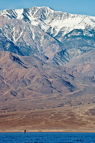
Terry Lawhon got in touch with me after seeing one of the shots I took at Badwater, on my birthday. He thought he recognised the cloud shapes from one of his shots! Turns out he was also out there that morning and took a shot of a photographer that was far off in the distance out on the Badwater salt flats. So that's me, above, in Terry's shot, shooting on my birthday and taking this picture, which has the same cloud form in it that Terry was also shooting.
badwater
badwater
I've never met Terry, we only found out about this conflux of location when he read my blog. Also Terry mentioned it was his birthday a few days earlier. Thanks to Terry for sending me the shot and also letting me share it here. You can see more of Terry's images from Death Valley at his website in the portfolio section. Small world.

pipes

There are a lot of people blogging about SoFoBoMo. So many in fact, that I didn't think I'd be able to keep track using Google reader, my normal blog browser of choice. So I headed over to Yahoo Pipes to build something to merge them all together. JL had told me about pipes. I was surprised to find how easy it was to build up a script using a visual flow chart style of programming. Each block performs some sort of function and you drag and drop them into a chart. Add in data sources, like RSS feeds, then drag connectors between the blocks to describe the flow of information. Throw in some filters, in this case to block things that are not SoFoBoMo related and then hit publish and you are done. There seemed to be quite a bit of complex functionality that could be created using this tool, to do more complex web aggregation and mashup sort of activities. Once published, it is a one step process to integrate it into a web site (e.g., the box to the left of this post) or add as one merged RSS feed to a reader. Quite a cool technology. You can find the SoFoBoMo pipe here. When it runs, the 'List' view is probably most useful and the various buttons along the top provide options to integrate it into a variety of other viewers. If you want your SoFoMoBo related blog added to the feed, I just need the RSS link. Feel free to add it in the comments here and I'll merge it into the pipe. I seeded the list, based on this post by Colin Jago, so if you were on his list, you are already in. Update A couple of comments. I'm going to go through and delete comments from those asking to be added, once I've added the URL to the pipe. This is just so I can keep track. If your comment is gone, it just means I've got you in. Secondly, Rafa asked about the filtering mechanism. The pipe only includes posts that say SoFoBoMo somewhere, in the title, in the body of the post or in the categories or labels. It is fairly loose in what it will let through - all caps, mixed case, camel case, all lower case, pushed up against other words (SoFoBoMoGOGOGO etc) and SoPoBoMo's are also passable. Tagging the posts with SoFoBoMo should be enough to keep your posts in the feed. Please let me know if that doesn't appear to be working. It can take a few hours for new posts to appear, due to the delays in feedburner and Yahoo Pipes refreshing the lists. Finally, only posts that have a filled out title appear to end up getting a link created in the pipe. The post will still appear but will be truncated and it isn't simple to find a link back. So please, include a title on your posts.