Hobgoblins & Consistency
 I've been attending a portrait class at AMOA for a couple of weeks now. So far it has been good for me, to push me to really think about lighting and how to work with a subject. Mainly though, it has been a way to carve out 3 hours a week to think about portraiture and photography. The instructor is great with some really inspiring portraits of his own, but what I really enjoy about these sorts of things is to be able to see and share images with a wide range of different photographers. The levels of experience and areas of interest are all over the place so it is great to see what people are doing and discuss and share process and ideas.
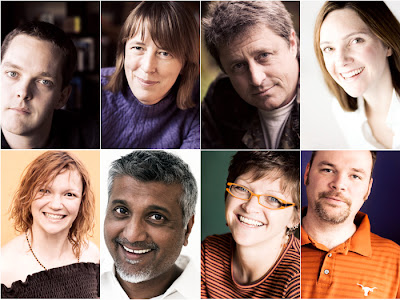
Last night we all put up three portraits from a series that we are working on. I used some of the images from my friends project. I'd shown one image on its own last week and the colour processing stood out from everyone else's work as somewhat different or odd. But when I put them together, the consistent treatment starts to work and my images pull together. After we talked about those three for a bit of time, I put the rest of the images up there - suddenly I could see that two stood out as not the right colour palette. Something was wrong - they didn't fit. What was interesting was I'd never seen that before - I think because I haven't yet put them out and really looked at them together.
Although I've been shooting this series in available light, the light that's available isn't always the same(*). Even though I've been applying the same set of colour manipulations to the images, the end results don't always tone in the same way - there's a couple that were shot outdoors that stood out as different and I think I'll need to re-work to fit in with the theme. I've been using the same focal length lens and roughly the same f-stop, but in a couple of cases I'm further away from the subject and that also stood out, side by side. On their own, they look perfectly okay, but as part of a consistent collection, the difference is clear. It is strange to realise how good your eye is at seeing the difference between colours - rather than seeing the absolute colours. Someone else had one picture printed at three different white balance settings. Each in isolation looked fine - the colour differences just were not very apparent - but when all three were shown side by side it really jumped out at you and only one looked right.
It was also instructive to note the effect of camera position, relative to the subjects in my portraits. The difference in camera height to subject height really changed the feel of the shots. Really subtle changes in where the eye level to camera level is changes the mood of the shots quite dramatically. The same with just where the person's head is, relative to the frame. Again this only really became visible to me when I started looking at the images side by side, so that I could compare the results.
I recently bought a metal rail for my office - I stick the prints up there to view them, so that they are in front of me more often. That way I can see them and they aren't hidden away in a box or on a hard drive. But I still hadn't confronted the images in the way I did last night. Taking the time to really look at them has given me new ideas on how to proceed - what needs to change, what's working and what needs to be adjusted. But what was good was how much they did all hang together and look like a consistent body of images. So I'm doing some things right and have some ideas to work out.
*There's an Arnold Newman quote where he was asked if he used available light and he replied 'yes, any light that's available'. I seem to be falling in to that mode.


3 comments:
I like seeing the whole set of shots together. It really brings a different dimension to this, rather than just a photo a week with a theme. Very nice!
excellent post ... well worth the read
Everyone of those portraits is exceptional. There is one, however, that just doesn't seem to fit. The first one. The placement of the face is so much different then the others. The eyes are more central. The others eyes are more in the upper left or right corners. I just wondered if you noticed that or did it on purpose?
Post a Comment