
UT Gobo light test 2
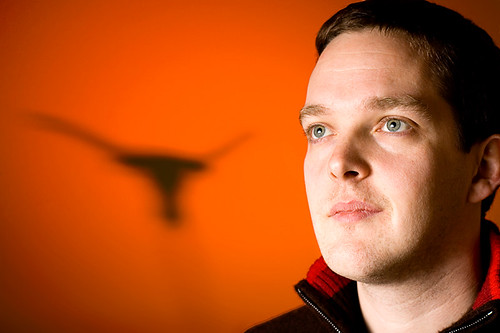
Second attempt (first here) at this idea for a University of Texas logo gobo and lighting test. Same basic lighting setup as last time (See Lighting Diagram), but with the key light firing into a umbrella about 2ft to camera left and quite a bit more background/ foreground separation. Background shadow isn't quite so well defined this time. Still playing around with the relative distances to cast a good, crisp shadow. Perhaps I need a bigger cutout to really get what I want.
This time I used the plamp to hold the cut-out, so gives it more of a floating in space feel, but that could be improved with a bit of photoshop to clean up the shadow at the bottom. Skin tones are also as shot, without any toning this time.


5 comments:
Great idea! I like the second attempt better, but I wouldn't know it was the UT logo unless I was told. (Sorry, but I must admit, I sat on the Rice or UH side!)
when you said UT logo, i thought you meant Unreal Tournament ... i was going to say that i used to love that game!!! haha!!!
i guess the logo is a steer head? it's not really clear. for a gobo light, you could probably make it bigger and sharper, so that it stands out ... like the batman logo! :)
it's a good setup though. it'll look professional for player shots and interviews and such.
nice lighting.
cheers
david
super-dave.com
I agree that the second attempt looks better. Great idea with the shadow.
This looks great, I like how the shadow looks and the colour is really nice.
I like the second one much better. both in the face and the shadow. It does look more like a steer.
Post a Comment