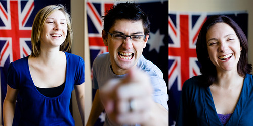
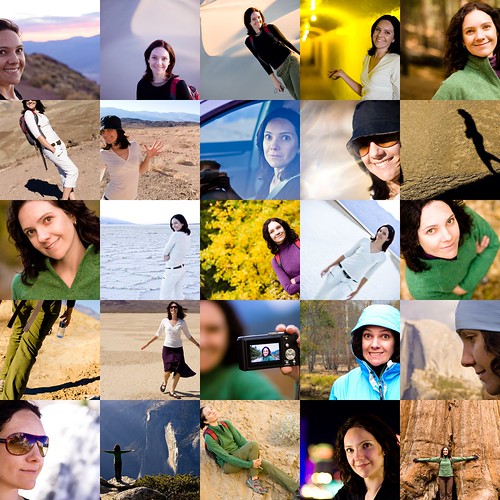
frustrated
but working through it.

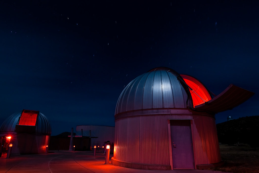
At the McDonald observatory, Fort Davis, Tx. Shot with moonlight and the red safety lights they use, to help preserve your night vision. The observatory does a few tours and star viewing sessions a week. I was really impressed by how good their presentations were and how well they explained things. Learned a few ideas that really helped through the whole week. Also got to see Saturn through a big telescope - could see the rings really clearly and a couple of the moons. It was almost a full moon last week, hence all the bright moonlight in this shot, shining off all 3 domes. Was also great for actually viewing the moon directly.
I've done the first pass on the images I took last week, cut away about 75% of the shots so far, down to a final selection of close to 500. There are quite a few potential HDR shots in there, maybe 100 or so frames to be combined as and when I work out a workflow for doing them. Getting there slowly.
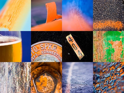
Paul had the good idea to request that we post more about SoFoBoMo and where the ideas flit in and out from, or try to capture some of the experience from last year that we gained. This evening an idea popped into my head for a SoFoBoMo project, while reading a different photography book. Reading always seems to stimulate these random ideas for projects. The main thing I've learned to do is to write them down. Then and there. So I was sent scrambling for a notebook, almost upsetting the cup of tea on the table beside me. It was just a simple idea, in part stimulated by Mark Hobson's post over on the Landscapist, about shooting a book in a day, that was very similar to Paul Lester's book in an hour from last year, One. I was thinking about what might make an accessible shoot to do in a day, maybe shooting from sunrise all the way to sunset or in to twilight. A good sunrise is always a colour event in my head and that triggered an idea from the book I'm writing, about shooting colours and using those as the motivation and guiding idea. I've used this quite often to help people get moving and taking pictures and I thought it would be a decent theme for a day's shoot.
Then I start thinking that I need 35 images and maybe I need to consider more than one colour. That leads easily to the colours in a rainbow - 7 colours, 5 shots each. Now that seems like something that could be shot in a day. Maybe the whole book could be shot and finished in a weekend without too much trouble.
But what does the book look like? Probably sections, themed or titled for each colour. Maybe I could use one of the standard mnemonics to bind the sections - Richard Of York Gave Battle In Vain. Or just go with something graphic using typography. The words repeated over and over, with the section picked out in that colour and everything else black and white. Or just repeat the word over and over.
Then maybe the pictures could tie or blend in to each other - so I shoot more solid reds for the middle images, but start to find some red/orange mixes for the overlapping sections, then more orange, all orange, then mix in some yellow and so on. These images could all be strung together small on one page as an overview of the whole book - 7 wide, 5 deep. Perhaps the cover page could be created out of letters shot on the same day, a red R and so on.
I might never make this book. It might be forgotten tomorrow - especially if I hadn't written it down. Maybe I'll come up with another 3 ideas and do 4 books in 4 weekends. This idea may well morph and evolve into something completely different. But the key was getting some of it down on paper. If you have ideas, respect them, capture them. You can always throw them away later and come up with more. But get used to paying attention to them and keeping them.
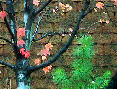
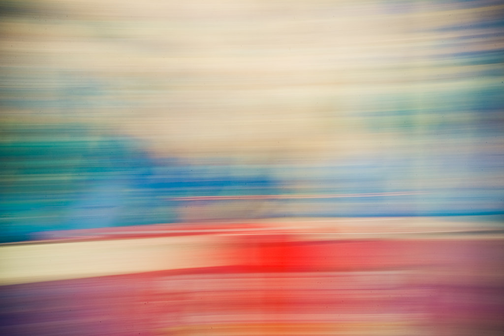
Took a picture today. Was writing in my journal over lunch, rambling on about creative blocks and things like that. Got back in the car and was struck by the wet trees and colour. The picture is taken with a camera phone and isn't exactly my best ever, but it was surprising how compelled I was to make the image. I'm getting back to wanting to take pictures and I think the things I'm doing to try to spur on my creativity are actually starting to work, no matter how much I'm fighting against it.
I also got a chance to use FotoFlexer to edit the image. Surprisingly effective and easy to use. Good to use in a crunch.
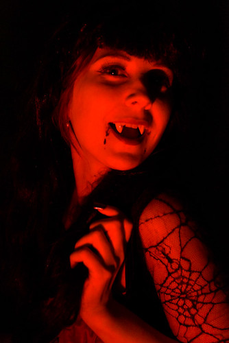
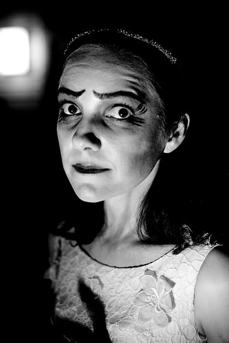
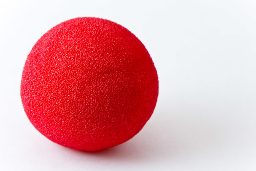
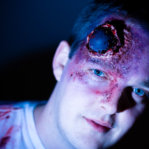
A good chance to put what I've learned about off camera lighting to the test. Well, really a chance to take everything I've learned and try to do the opposite! Amanda did a fantastic job as the corpse bride. I had fun playing with make-up to give myself a big head wound, with a squash ball smack in the middle. Kate went for a classic vampire look. A lot of low angles with the flash and up close to get harsh shadows and quick fall-off. Was also a good time to use all those wacky coloured gels that you can't normally get away with using!
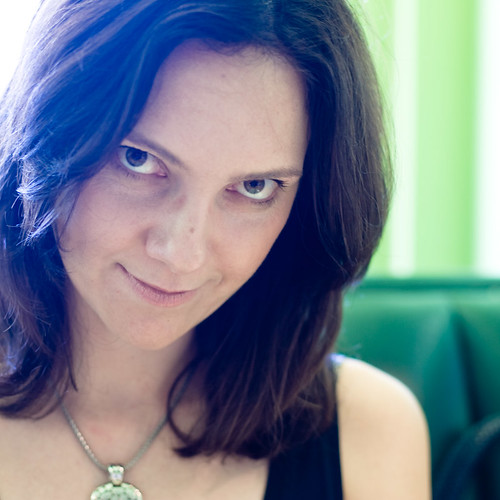
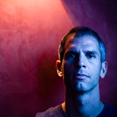
A couple of common themes for portraits in the last week. I did a lighting class last weekend and found while doing the more controlled, constructed lighting was interesting, I was still spending more time playing around with the ambient and trying to accentuate the lighting in the location. I'm not sure if I just don't really have the imagination to see completely contrived lighting, or I think really, I'm just not motivated enough to want to create it all from scratch. I do like finding the interesting light already available, then trying to build on that. I did some shots using strobes and adding in lighting, but I was still mostly working with the light I could find. One that I like was where I replaced the existing light with a strobe to essentially mimic what was there already - but being able to shoot at a much lower ISO and smaller aperture. It was in a hallway with a bare bulb hanging in the ceiling (below right) and I liked the light quality. With some help I put a strobe and a small softbox up in the same place, getting very similar light but slightly less harsh. A grid over the softbox helped control the fall off and edges, to shape it a bit more. I'd picked this hallway for the blocky green and orange wall paintings and thought it'd play well with the checked dress the model was wearing. All that I think works well, along with the lighting - but I struggle with posing a full body. That's why so much of my photography is tighter head and shoulders shots - fewer limbs to position and deal with.
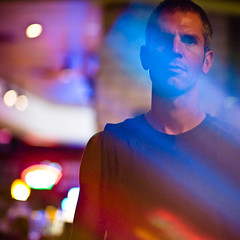
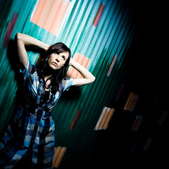
Another theme has been shooting using windows and mixing in the daylight with the available indoor light, playing with the mixed colour temperatures that you find around those edges. Eric Ogden has many portraits shot with the window actually in the frame, blowing out behind the subject and I tried a bit of that with the portrait of Amanda above. Just put the meter on center spot to ignore the background and shoot for these - nothing too clever going on. I like how the outdoor light turns slightly blue when her skin is balanced for the indoor light - made a bit stranger by the fact we were in a predominantly green-walled restaurant which added some unique colour casts to the shot. I also used an old idea of shooting through glass, for the second shot of Kevin, above, using the neon lights in the bar we were in, along with an empty, slightly dirty pint glass in front of the lens to create the coloured flare.
I've also been thinking about and cropping nearly all the shots over the last week to a square format. I've been shooting with that crop in mind and just seeing how it works for me. I doubt there will be a Hasselblad anywhere in my near future but that different crop has been interesting to work with. I'm blaming looking at Mark Tucker's portraits for that particular influence. I don't think it is something I'm going to keep doing much longer but it was interesting to try adding another arbitrary constraint into how I was shooting for a short time. It certainly changes how you arrange things in a frame.
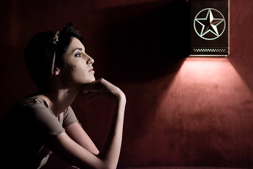
Another shot, (below) was lit using the available light and the modeling lights of the alien bee strobes that we were using. I'm not sure that that really counts as using the strobes properly, but any light that's available counts. the modeling light is low to the camera right, balancing with the wall light fixture. This could be another example of me only being able to see what the continuous sources give well and not having enough experience to predict how the brief strobe will act, but I much prefer working with the continuous light sources - it seems to suit my biases and process. Maybe I should be thinking about video more!

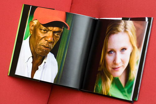 Assembling the book was straightforward in booksmart. I uploaded the final version after some previewing and bought a copy. Surprisingly, the book shipped only a couple of days later - I'd expected a longer lead time. The book arrived in decent packaging, quickly and without any problems. There I had it, a few days later, a book of my photos! First thing is to notice how fantastic it is to have a hardbacked book of your images. There's a certain thrill to that that is difficult to replicate with online displays or even individual prints, mounted and framed or not. I know all I did was pay some money, there's no real validation involved, but it sure looks good! I've put together a few books for different purposes and the feeling hasn't gone away yet. The second thing to note is that 28 sides (14 pages) isn't very many. You end up with quite a slim volume, particularly in hardback. All cover and no content, if you aren't careful.
The slip cover looked great - particularly that green I'd been worried about translated very well, close to how it looked in the soft proof. I'm impressed with how similar it all turned out - throughout the book. On the other hand, I think if I'd uploaded straight, unadjusted sRGB versions of the files I would have been quite disappointed. Some of the original colours just wouldn't have worked out at all. Blurb doesn't make a big deal out of mentioning this - it is there on their site, but they certainly don't push colour management and soft proofing. Something to watch for.
The print quality is certainly not as good as I can get from my inkjet (an Epson R800), but is certainly well above acceptable on most of the images. There is a slightly visible cross-hatching in the smoother areas of some images, if you look particularly closely, but from a normal viewing distance all of the images look great. Some of those that were slightly less sharp than others really become more noticeable on the printed page. Also higher ISO black and whites lost a lot of the presence and depth that they have online. They just don't translate too well, the noise becomes more noticeable, the contrast isn't as strong and they just don't have the same amount of life.
The one disappointment for SoFoBoMo is that booksmart isn't a simple way to get a PDF of your book. At least, not without a large watermark through each page. using pdf995 I was able to get a final PDF of the book from booksmart, but the layout is not great and the watermark is very visible. Might do in a pinch, though.
I also made one rookie mistake, putting something too close to the edge of the slip cover. The cropping is probably about a quarter of an inch tighter than the previews - certainly you are well warned about this but I almost lost an eye from the cover! This particular book has a bar code printed on the rear. From blurb's blog it appears that different printers and different books may or may not end up with this bar code. I've also read that all of the books larger than 7" are printed on a slightly better printer, so the quality should improve even over this quite acceptable start.
The binding seems solid, the book feels like a real book. The pages appear to be glued and stitched into a cloth-backed hard cover. It all looks professionally put together, though a bit skinny. A 14 page book cost $22.95 for the 7" hardcover, plus $8 shipping. It is the same price, up to the first 40 sides. Note that blurb refer to pages as each side of one physical piece of paper being one page for the cost calculation. An additional $3 doubles the page count and the book would start to feel more substantial. White space is your friend. Overall I'm happy with the results and plan on using blurb for a final copy of my SoFoBoMo book.
Assembling the book was straightforward in booksmart. I uploaded the final version after some previewing and bought a copy. Surprisingly, the book shipped only a couple of days later - I'd expected a longer lead time. The book arrived in decent packaging, quickly and without any problems. There I had it, a few days later, a book of my photos! First thing is to notice how fantastic it is to have a hardbacked book of your images. There's a certain thrill to that that is difficult to replicate with online displays or even individual prints, mounted and framed or not. I know all I did was pay some money, there's no real validation involved, but it sure looks good! I've put together a few books for different purposes and the feeling hasn't gone away yet. The second thing to note is that 28 sides (14 pages) isn't very many. You end up with quite a slim volume, particularly in hardback. All cover and no content, if you aren't careful.
The slip cover looked great - particularly that green I'd been worried about translated very well, close to how it looked in the soft proof. I'm impressed with how similar it all turned out - throughout the book. On the other hand, I think if I'd uploaded straight, unadjusted sRGB versions of the files I would have been quite disappointed. Some of the original colours just wouldn't have worked out at all. Blurb doesn't make a big deal out of mentioning this - it is there on their site, but they certainly don't push colour management and soft proofing. Something to watch for.
The print quality is certainly not as good as I can get from my inkjet (an Epson R800), but is certainly well above acceptable on most of the images. There is a slightly visible cross-hatching in the smoother areas of some images, if you look particularly closely, but from a normal viewing distance all of the images look great. Some of those that were slightly less sharp than others really become more noticeable on the printed page. Also higher ISO black and whites lost a lot of the presence and depth that they have online. They just don't translate too well, the noise becomes more noticeable, the contrast isn't as strong and they just don't have the same amount of life.
The one disappointment for SoFoBoMo is that booksmart isn't a simple way to get a PDF of your book. At least, not without a large watermark through each page. using pdf995 I was able to get a final PDF of the book from booksmart, but the layout is not great and the watermark is very visible. Might do in a pinch, though.
I also made one rookie mistake, putting something too close to the edge of the slip cover. The cropping is probably about a quarter of an inch tighter than the previews - certainly you are well warned about this but I almost lost an eye from the cover! This particular book has a bar code printed on the rear. From blurb's blog it appears that different printers and different books may or may not end up with this bar code. I've also read that all of the books larger than 7" are printed on a slightly better printer, so the quality should improve even over this quite acceptable start.
The binding seems solid, the book feels like a real book. The pages appear to be glued and stitched into a cloth-backed hard cover. It all looks professionally put together, though a bit skinny. A 14 page book cost $22.95 for the 7" hardcover, plus $8 shipping. It is the same price, up to the first 40 sides. Note that blurb refer to pages as each side of one physical piece of paper being one page for the cost calculation. An additional $3 doubles the page count and the book would start to feel more substantial. White space is your friend. Overall I'm happy with the results and plan on using blurb for a final copy of my SoFoBoMo book.
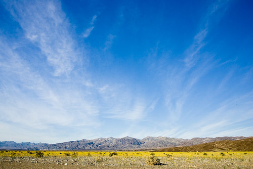
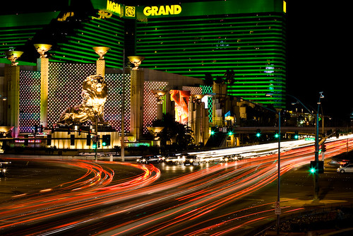 The wide open skies and flat desert was quite a contrast to the scene the night before in Las Vegas. I met my friend, Marti, at the Vegas airport and then we went for a walk around the Strip to find some dinner and do some shooting. I didn't take a tripod but managed to find enough ledges and walls to perch my camera on to get a few long exposure shots that I'm happy with. These days, the best thing about Las Vegas is using it as a jumping off point to all the amazing national parks that cluster around that part of the country. Only about a two hour drive between the scene above and the scene below.
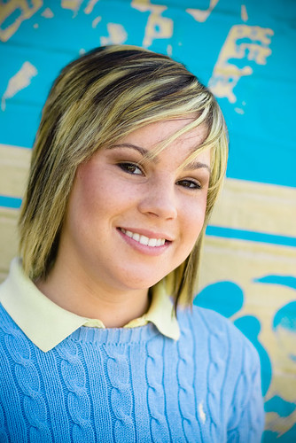
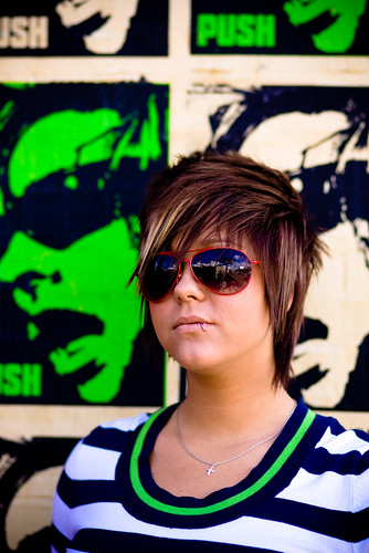
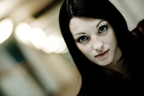
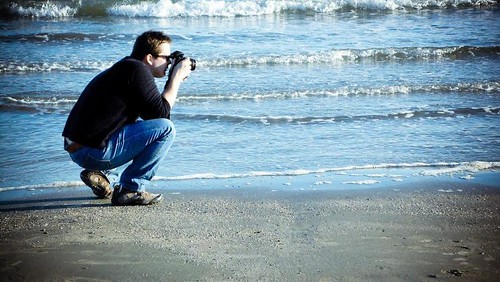

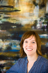 Caroline Wright (left) paints gorgeous abstract images, capturing beautiful light and scenes that I could just get lost in for hours. Lovely use of colour and space. It was intriguing to hear how sound inspires some of her work and you could really see the dynamic tempo in those pieces.
Ava Sharifian (above) paints what seem to be organically inspired, colourful canvases, full of movement and life. Her work was so dynamic and lively. Spirals of brush strokes blending in to planes of colour, huge canvases that seemed just perfect. I wouldn't know how to even start creating something like that - the huge empty canvas would haunt me. Perhaps I'd have even more trouble knowing when to stop.
Caroline Wright (left) paints gorgeous abstract images, capturing beautiful light and scenes that I could just get lost in for hours. Lovely use of colour and space. It was intriguing to hear how sound inspires some of her work and you could really see the dynamic tempo in those pieces.
Ava Sharifian (above) paints what seem to be organically inspired, colourful canvases, full of movement and life. Her work was so dynamic and lively. Spirals of brush strokes blending in to planes of colour, huge canvases that seemed just perfect. I wouldn't know how to even start creating something like that - the huge empty canvas would haunt me. Perhaps I'd have even more trouble knowing when to stop.
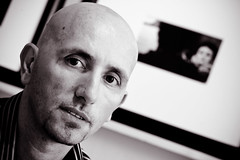 Piercarlo Abate's studio was the first place that I stopped on the tour - he also happened to be number one on the list. He really set the tone for the whole day - warm, friendly and inviting, with some great photography of Venice and also some lovely portraiture work. We talked for a while and he made me feel very welcome. He was also shooting a project, using the people visiting his studio as part of his art - seemed like a great idea! You can see a video of the project he shot last year as part of EAST, on his web site.
Jennifer Balkan (below) had a wide variety of nude studies in her studio - but a piece that she had done of a rabbit, in a Alice in Wonderland theme, really caught my eye. Deep purple drapes set off an almost blue, white rabbit. I think it was the use of colour that really caught my eye about that piece. She also does a lot of work mixing in maps with figures, combining the sense of anatomy and networks of veins in a body with the similar feeling that can be found in a map - waterways, arterial roads and the like. Really interesting work and my friend Erin was really excited to see I'd taken her picture!
Piercarlo Abate's studio was the first place that I stopped on the tour - he also happened to be number one on the list. He really set the tone for the whole day - warm, friendly and inviting, with some great photography of Venice and also some lovely portraiture work. We talked for a while and he made me feel very welcome. He was also shooting a project, using the people visiting his studio as part of his art - seemed like a great idea! You can see a video of the project he shot last year as part of EAST, on his web site.
Jennifer Balkan (below) had a wide variety of nude studies in her studio - but a piece that she had done of a rabbit, in a Alice in Wonderland theme, really caught my eye. Deep purple drapes set off an almost blue, white rabbit. I think it was the use of colour that really caught my eye about that piece. She also does a lot of work mixing in maps with figures, combining the sense of anatomy and networks of veins in a body with the similar feeling that can be found in a map - waterways, arterial roads and the like. Really interesting work and my friend Erin was really excited to see I'd taken her picture!
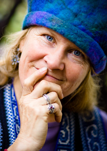
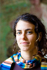 The final portrait I took was the one I posted yesterday, of April Bederman, who makes dramatically colourful hats. She was showing in a part of a studio that was shared with Barry George who is a sculptor, working mostly in metals. April's hats were on display on some of that sculpture and the mix of hard iron and her bright, soft fabrics was quite unusual.
I visited a few other studios and artists - but these were the people who I felt I managed to make some small connection with and were kind enough to work with me on a portrait. What they didn't know was that I printed out my favourite shot of each of them and then went back around this morning to give them a print. I got quite the range of reactions to that. Everyone was very kind and positive, but most of us have a hard time when faced with ourselves in a picture. I think that's why so many photographers create self-portraits that are so abstract or hide the face. We all have our issues to deal with. It was a lot of fun to be able to turn up unexpectedly and hand over the print.
I spent quite a bit of time talking to April again today and she turned the tables on me and took my picture. I suppose that's fair game! EAST was a great experience - I'm really glad that I went. Also setting myself this small assignment meant that I made more of an effort to connect with these people and find out about their art and motivations. I got a lot out of that experience that I don't think would have happened if I just went in and looked quickly, then moved on.
The final portrait I took was the one I posted yesterday, of April Bederman, who makes dramatically colourful hats. She was showing in a part of a studio that was shared with Barry George who is a sculptor, working mostly in metals. April's hats were on display on some of that sculpture and the mix of hard iron and her bright, soft fabrics was quite unusual.
I visited a few other studios and artists - but these were the people who I felt I managed to make some small connection with and were kind enough to work with me on a portrait. What they didn't know was that I printed out my favourite shot of each of them and then went back around this morning to give them a print. I got quite the range of reactions to that. Everyone was very kind and positive, but most of us have a hard time when faced with ourselves in a picture. I think that's why so many photographers create self-portraits that are so abstract or hide the face. We all have our issues to deal with. It was a lot of fun to be able to turn up unexpectedly and hand over the print.
I spent quite a bit of time talking to April again today and she turned the tables on me and took my picture. I suppose that's fair game! EAST was a great experience - I'm really glad that I went. Also setting myself this small assignment meant that I made more of an effort to connect with these people and find out about their art and motivations. I got a lot out of that experience that I don't think would have happened if I just went in and looked quickly, then moved on.