Friday, February 29, 2008

Death Valley, after the storm

Death Valley, after the storm

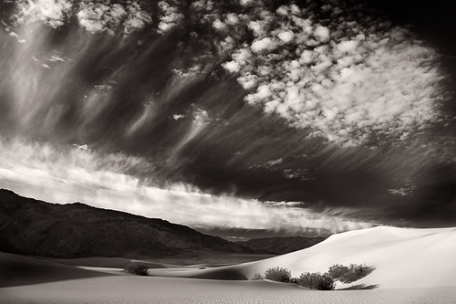
I'm heading off for a few days to Death Valley National Park. It's my birthday and I'm taking a few days to do some shooting and maybe try to write a bit more. This shot here is one of my favourites from the first time I went to the park. I'd been shooting all week and this was the final day. We were stretched thin by lack of sleep and there had been a blowing sandstorm a few hours before. I'd hiked out with the group through the sand and got some beautiful shots of the sunrise. I was tired and finished. Walking back to the car with the instructor, Craig Tanner, we were just chatting about things, then suddenly we noticed this scene unfolding in front of us. I was tired, ready for breakfast and almost didn't bother taking a picture. The sun was up. The shadows were getting pretty harsh, it just didn't look like a good photo to me, but Craig was excited. So I took a couple of frames. For me, this was probably the biggest lesson of the trip. I still haven't quite worked out what that lesson was, though, three years later. So I'm going back for another crack at it. See what I can learn on my own this time, listening to my own thoughts. I think since then, I've come to learn what a huge part clouds play in Craig's process - so maybe that was part of his excitement. I was on my first ever landscape workshop and hadn't really taken that concept in, until I got home and looked at the images I shot this particular morning. I was also still pretty green at making black and white images - still am really. This shot took a bit of coaxing to really appear from the original. Mostly though, this shot takes me back to the conversations I had that morning and the feelings I had enjoyed surviving the blowing sand and making great pictures. Nobody else gets to feel about this shot, the way that I do and that's okay. Maybe that's the lesson - the images have to stand on their own, as they don't tell others how you felt when you took it. Unless you really manage to put your heart and soul into them.

Monday, February 25, 2008

green

green

For this week's Austin Flickr meet-up I suggested we do something of a themed shoot. Got a load of bits of paper with colours written on them and then anyone that was game picked a colour at random. That's your new favourite colour for the next few hours - go shoot it! We decided that the 6 primary (for additive and subtractive) colours were a good starting point - red, green, blue, cyan, magenta and yellow. I picked green. First reaction (it always seems to be this reaction) oh, no, not green. Any other colour. Not green. I don't know why my brain always seems to rebel at these externally imposed, random constraints. It is never what I want. I looked out side, tons of vibrant reds, blues, cyans, magentas and yellows assaulted my eyes. No green, just bushes and grass. Boring. I want another colour. But I'd suggested this stupid assignment in the first place, I can't be the first person to quit! So I buckle down and start trying to shoot green. Then, as often happens, my eyes make that switch. I tune into the green theme. Green's are everywhere, all these green options to shoot. Why would anyone want to shoot any other colour, ever ? I'm still suffering the aftershocks this morning, seeing interesting green things to shoot all around. Maybe I'll always have that initial dislike of the random constraint. But it makes me think that element of randomness is important, otherwise I'll tend to pick something I'm comfortable with if I don't know what to shoot. I'm back reading the Lonely Planet Guide to Experimental Travel - I think there's some great ideas in there that could be adapted to random photography games. Odd book. Interesing book.
prêt-à-porter agave

Sunday, February 24, 2008

tom spreads his wings

tom spreads his wings

On the way to the weekly flickr get together I spied some garage doors that looked interesting, about a block from where we were meeting. Afterwards I mentioned wanting to take a couple of shots there and a few people walked on down. Tom was kind enough to act as the guinea pig and stepped up. There's 5 doors all painted with similar but differently coloured graffiti. I think I might be back again. I'm more tuned into the idea of finding backgrounds and as a result, I'm seeing great opportunities that just need a person in the right colours to set it off. I think this works quite well.

rebekah

rebekah

More portraits with the nose, but this time with some fill flash. Mike was kind enough to be my mobile light stand for this shot, trying to fill the shadows a bit against the direct sunlight. Colour is processed a bit to pull up the greens, balancing against that big old red nose. Originally she had a black top over the green, but seeing the potential to play it off against the red, we switched things around. Not a whole lot of green but just enough on the edges to frame and play against the red. Something I've been playing with is to ask people to focus behind the camera, through the lens. Typically if you ask someone to look at the lens - they literally do that - focusing their gaze right on the end of the camera. Asking them to try to look through the lens and focus around where my head is seems to make a subtle shift in where they are looking - it seems to be much more directly at the viewer. Probably something to do with viewing distance of the portraits I suspect. From my brief foray at the opticians, I know your eyes tend to move further apart as you focus on distant objects, so maybe we can pick up that subtle shift in the pictures.

Friday, February 22, 2008

in Design

inDesign

Actually fired up Adobe InDesign yesterday evening and tried to lay out the rough idea for my SoFoBoMo book. I had been thinking about using blurb's BookSmart software, but it seemed to want to thwart me at every turn. Sure it should just be as simple as dropping pictures on the page and adding some text, but any time you want to add a twirl or a bit of personalisation, BookSmart wants to keep you to the template. So I've decided to head down the custom page layout approach. Try to come up with a simple layout, make pages that way. Then I can either churn out a pdf, or create individual jpgs that can be uploaded to blurb/ shutterfly et al as full bleed pages for their book software. I think that shouldn't be too painful. First major barrier is my complete lack of design sense. But I'm working on that. Second was trying to unlearn all the powerpoint ideas that have seeped into my brain from being an engineer for so long. Slowly getting there. The InDesign interface is still currently an arcane and confusing world, but I managed to knock together a basic, simple layout that I'm reasonably happy with as a starting point. Font choices, colour schemes, style and flair all still sadly lacking, but I think I see a path now. Also missing is any feeling that I'm working at the correct resolutions or have got my head around what size the images need to be at. I think my plan is to work that out then output directly from Lightroom at that size. Probably try to skip any Photoshop localised editing if I can - that's been the way I've been shooting anyway for a while now so I don't think I need to over complicate things just because its a book.

Tuesday, February 19, 2008

crystal & chelsea

chelsea crystal
I met this pair on South Congress, while out shooting with Chris after the flickr meet. They were trying to take a picture of themselves, so we offered to help out. Then followed up with the obvious request. What I like about these was how I found backgrounds that really complimented their clothes and style. The posters reflect the themes in their hair style or glasses as well as fitting in with the black/white & green colours, or the pale yellow and blue. I feel I've come a long way from timidly asking if I could take a picture then snapping off one shot. I was able to think about this, ask them to move a few feet to a suitable background and get better results. The amazing part for me is that both of these shots were taken about 3 feet apart and I could find such diverse and complimentary backgrounds so easily. I'm finally starting to feel like I'm slowing down and getting a bit more comfortable with this portrait photography. Long way still to go.

Sunday, February 17, 2008

but what to ask ?

the back and forth

I've kicked around quite a few different ideas for SoFoBoMo. What project to do ? I seem to have two main branches to the photography I like to do. The solitary, considered types of shooting, abstracts, colours, landscapes that I really enjoy and that really refreshes me. Then there's the seat of the pants interaction of portraiture that inspires and exhausts me in equal measure. One introverted and calm, the other extroverted and exciting. I really enjoy meeting people and the interaction that goes with shooting portraits, particularly with people I've just met, but I find I shy away from it unless I push myself. Over the last few weeks I've thought of colour assignments or local walks to shoot for SoFoBoMo. Shooting on South Congress last week with Chris made me realise I was just avoiding the most obvious and interesting SoFoBoMo project - just keep shooting people. So that's going to be the SoFoBoMo assignment - a month of the people who I meet. I'm actually going to carry my camera with me a bit more often. I've always been skeptical of those who say they have a camera with them all the time because you never know when a photo op might occur. I never really bought in to that, because the good photos that I've taken have always required at least a bit of forethought or planning. I don't often stumble across a great opportunity - usually I'll decide I have to come back later when the light is good. But I'll try it for a month. To make it a bit more interesting in book form, I'm trying to think of a good question to ask each person, so that I can then include the answer. So that's where I throw this out to all of you. If you could ask one question of a complete stranger, what would it be ? What would you like to know about that person standing next to you at the bus stop or on the train ? Karen asks a great question in the comments. Are you also doing model releases? The short answer is no, I'm not going to ask for model releases. The somewhat longer answer is my understanding is they aren't needed for editorial & artistic usage. I'm not planning on selling these images for stock. I don't use them for advertising. The book will simply be an art/coffee table book. Dan Heller publishes a lot of good articles about model releases and the need or not for them. This section on art books/ exhibitions etc is particularly relevant. The other reason I'm not too concerned is I'll be talking to the people I'm considering using. I'm not snapping away from the far side of the street with a 200mm lens. I'll be right there 4 feet in front of them, asking if it is okay, giving them my card and offering them a print. If they are uncomfortable with any of the process, I'll just move on to the next person, or not use their image if I've already taken it.

Tuesday, February 12, 2008

page sequencing

the throne room

A couple of blog posts moved me to consider how I read a book. Partly this comes from thinking more carefully about how to put a book together for SoFoBoMo. I vary in how I approach and read books. I tend to pick and choose pages or graze photobooks, typically because there's no valid reason not to. I do the same thing with recipe books, or other types of content where the order is largely irrelevant to understanding the content. Certainly, there might be some structure imposed on a recipe book - starters, meat, sides, dessert or some other thematic links - party food, soul food, fresh and light, but those are just ways of sorting the ideas. The sequence isn't really meaningful. A novel is a different bundle of pages. Few people, other than the most pessimistic, would read a fiction book from the last chapter then graze around, picking random pages to read. That's because in a story, the order matters. Very, very few photographic books ever seem to have any necessary viewing order to them. The photographer or book designer might well agonise over sequencing (as Paul Butzi does in his recent blog post) but really, does it matter ? Some photo-journalistic pieces certainly tell a story but I haven't seen many of those published in book form - typically the best images get extracted, removing the surrounding context or those images that add to and build up to or lead away from the heroic images. So in the photobook every image seems to count but fundamentally stands alone. There's a more localised sequencing that can happen, such as the layout of multiple images on a page, or how a pair of images are selected on facing pages, providing that ying and yang that you land on when you open the book. But rarely do the surrounding pages really flow in any sort of important sense, other than perhaps as bundles of thematic ideas - all the same place, all the same colour, all women, all men. All standing essentially alone. If there is some reason to the structure or some advantage to following it, then people will. If there isn't or it isn't sufficiently compelling for people to care, then they wont. But if it doesn't matter, it doesn't matter, now does it ?

haley

haley haley
85mm, 1/800sec @f2.2, ISO 100
These pair of shots of Haley were taken on a side street, just off South Congress Avenue in Austin. She was one of Aaron's friends that we asked to pose for us for a few minutes. This side street has several really brightly coloured store fronts that I wanted to try out for backgrounds. The sun hits the other side of the street so there is a lot of bounced light, but the walls are in shade so it is a great spot for calm, bright, wrap-around lighting. In the left shot, I picked a colour background that would be in the same hue family as her top. In the second shot I went for something much more contrasting, getting her to split the difference between two areas of colour. I think they end up having a really different feel to them as a result. The red on red shot has a much calmer, warm feel while the blue and green really jar the eye and create a lot of contrast that is much more dramatic. I find it has a more playful feel as a result. The great thing is that these two significantly different feeling shots were taken about 5 feet from each other. Great backdrops are everywhere - I've never understood why someone would use a grey muslin. I'm sure it works for some people, just doesn't work for me.

Sunday, February 10, 2008

wait here

aaron85mm, 1/1250sec @f2.2, ISO 100
Went to another flickr group meet up yesterday, in South Austin. Afterwards, a few of us decided to do some street portraits up and down South Congress. At the flickr meet, Chris had asked me how I go about shooting strangers and street portraits. We talked a bit about some of the techniques that I find work and things I'd learned on the Next Step workshop. I agreed to go shoot with him and back him up until he got around to asking someone. South Congress Avenue is a busy street with a lot of colour and colourful people. There are restaurants and lots of distinctly Austin stores. Within a few minutes we met Aaron (in the center above) and a few of his friends (on the left). It helped that they approached us in the first place, looking for spare change, so we easily turned the tables on them and asked if they'd let us take some natural light portraits. They were really in to it and just wanted to have something fun to do. Chris was a bit nervous at first about approaching people, so this group were a real ice breaker and easy introduction. They were high energy, enthusiastic and didn't care what people thought about them. We tagged along and used them as an opening for quite a few portraits and that got us into the flow. I'll be posting more of those later in the week. People would react and talk to them and get sucked in to the group, as we walked along. Further down the street, a couple ran up behind us, wanting to pose with Aaron and his sign. They were happy to oblige and got a good tip for their work, too. I really like what's going on in this shot, the energy in Aaron's pose, the contrast in styles with the woman who is posing with him and then his friend looking on. This shot was converted to black and white in Adobe Lightroom, then I've dialed back in about 33% of the saturation to get to this partially colored look. The expressions and posing really make it for me, along with his friend's glance on the left.

What makes a great portrait ?

dale & marti

A busy week and a quiet one, photographically. I did just spend an enjoyable few minutes reading this post on Conscientious about What makes a great portrait. Particularly interesting was how many responders were quite dismissive of portraits as a style of photography. Maybe not dismissive, but perhaps disappointed in the fact that a portrait really can never capture a piece of the sitter's soul. Avedon said quite famously that Every photograph is accurate. None of them is the truth. At least I suppose, not the whole truth. Though the reality that a lot of portraits are perhaps more often lies. From the basic admonition to smile to the more posed or controlled expressions in formal portraits, it doesn't always or often reflect the real mood of the subject. For me a lot of this doesn't really matter. If the viewer doesn't learn something about the subject of the portrait, that is secondary for how I'm taking pictures just now. The big change and contribution from taking portraits, for me, is the interaction between the photographer and subject. I get to meet people I wouldn't normally meet. I approach people and talk to them in places I wouldn't normally. The experience of taking the pictures changes me as a person, expands my horizons and the end picture is just a side-effect.

Sunday, February 03, 2008

what is a book ?

what is a book ?

Silly question, surely. We all know what a book is. Particularly a photography book - it's just a collection of pictures - right ? But really the ordering of those pictures matter. The sequence can change how the viewer feels about the images. Within that, the relationship of pictures on the page to the pictures on the facing page can have a big impact. Another way to consider a photo book is as a series of diptychs. Each pair of images combine to show something larger than the individual images alone. Perhaps two sides of the same object, or maybe a wide view then a tight crop. The whole set of images in the book should hopefully tie together under some cohesive theme, but locally the pages could be used to create an even stronger whole. I think I first became aware of this relationship listening to Brooks Jensen describing the layout of pages in Lenswork. As I think more about what I'm wanting to do for SoFoMoBo, this idea has come back to me. A happy side effect is that instead of having to come up with 35 images, now I maybe only really need to come up with 17 pairs of images. Same number of shots, but half as many concepts. I'm not yet sure if that's going to be harder or easier to shoot.

Friday, February 01, 2008

vassiliev

I found a link to the portraits of Alexei Vassiliev over on the Conscientious blog. I've drifted in and out of shooting totally blurred images and have recently started revisiting those ideas. Some of these portraits are really stunning. Worth a look. I think the stronger portraits are where the colour really makes the images striking - strong blues, vibrant reds. I've continually been fascinated with really shallow depth of field or even totally blurred images. I'm going to make more of an effort this year to shoot in this style and see where that goes. Uta Barth is another influence in this direction, for me. There's something about these forms of images, that often ask more questions than they answer that really engages me. I've been trying to move away from a totally literal style of photography, where everything is there for the viewer to grasp, quickly. Blur and out of focus regions tend to make me spend more time with an image, wondering about what might be there. Totally out of focus seems to take that to its logical conclusion.