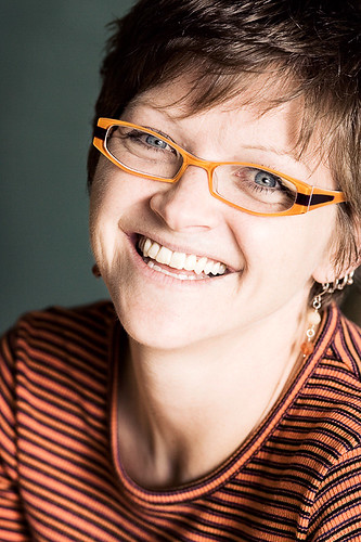
Nedra
Nedra is a good friend of mine who I met through training for a triathlon a few years ago. She is an exceptional runner and recently qualified for the Boston marathon. There is no way I can keep up with her! This shot was taken in her home. The room is painted a really subtle green which I wanted to use to compliment her orange/ purple top. That top also played well on her signature glasses.
I've recently been paying more attention to some of the ideas from colour theory and looking for complimentary colours, or close to complimentary colours to play on in my photography. Here the green/teal and orange are close to opposites and work well.
The lighting is really simple, just window light behind me, to the camera rear/right. We set up and just talked a bit and shot several frames. Nedra even took her turn playing with my camera and shooting me, to get a feel for what I was seeing. Between that and showing her some of the results on the back of the camera, I think I managed to break the ice and give her a better idea of what I was trying to achieve.
Post processed with the same partial desaturation and dodge/ burn that I've been working with for all of the portraits in this project. I've printed them all out and they are really starting to hang together thematically and visually. I'm also finding that the commitment to shooting in a similar style and subject over and over is really helping me to learn more about what I'm trying to do and how to improve each time.


3 comments:
Another intersting post. I feel ashamed, how often I do not care much about details. I can really appreciate somebody's clever idea and thoughtful execution, however when it comes to myself I rarely have enough time and patience. Working every day doesn't leave me much time to experiment, but I have to say I love it. I have a "thing" for photography since quite some time. Too often however I get frustrated for not getting decent results. I hope reading your blog will set me a goal to achieve somwhere in the future and help me make my photography path less chaotic. Excellent portrait. I can see she felt very comfortable with you and your camera. Thank you also for the link to the podcast on colour theory. I heard about it, but never really studied it.
I really love the processing on this and also the fact that you're working with natural light. Wonderful portraits, the lot of them.
The background color you chose really brings out the color of her eyes and makes them pop. A fabulous portrait!
Post a Comment