don't be blue
My favourite colour is blue. I'm drawn to that colour, love water, shoot a lot outdoors with a tungsten white balance and am generally calmed by the whole blue palette. It suits my mood and normal emotions, all of the standard stereotypical ideas that you'd associate with blue. It's my colour.
But on the Next Step workshop one day I was asked to make a series of images that thematically tied to that colour. I wasn't having a great day due to some hard assignments the night before and I started journaling and thinking about ideas around the theme of blue. I wrote words like 'cool light', 'shadows', 'orange compliment', 'tungsten', 'sad', 'lonely', 'moody'. Perfect for my mood. Perfect to keep me in the mood I was in. But I wanted to change that up. So I decided to go 180 degrees and head in the opposite direction.
My first thought on this was to shoot red. But I don't shoot red. For some reason, you won't find much in the way of images based around the colour red in my portfolios. I have a lot of blue. There's a lot of yellow and blue or orange and blue too. Plenty of other colours, green features heavily, but not much red at all. I tried to throw the choice out to someone else, so that I wouldn't be biasing the decision. I asked a couple of people what their first impression of the opposite of blue was. Yellow was one answer. Red was the other. That settled it. For this assignment, I chased red around for the morning.
It was really interesting to shake things up like this - suddenly I was tuned in to a whole different colour palette. I was seeing red everywhere, where before I'd hardly notice it as a photographic concept. Signs assailed me from every direction (we were shooting in downtown Savannah - a typical urban area in many respects). People wearing red jumped out at me. It is amazing how much you can find as soon as you go looking for something. Things you'd normally just walk right passed become a focal point for a shot.
I've done this sort of assignment many times with shapes or textures. I'll decide to go and shoot circles and suddenly the whole world is made up of circles and arcs. I'll think about shooting lines and everything is an edge. Look for rough textures and the world is a scratchy place. But I haven't tried it with colour before. Sometimes I've worried that when I go and shoot in a particular theme, I'll miss lots of other shots, but the opposite always ends up being true.
Instead of walking around, trying to find something, anything to shoot, having a theme in mind focuses me in quickly. I start working earlier, with more direction and focus. On days without a theme, I end up with a mismash of different ideas, some half formed, others not so far along. Days with a theme tend to spiral towards a goal, I might abandon the theme after 10 minutes, because the real theme comes along, but I'm attuned to the idea of working on something and it makes me much more productive. So give yourself an assignment every day you go and shoot. It can work wonders to get you moving.
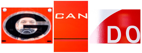
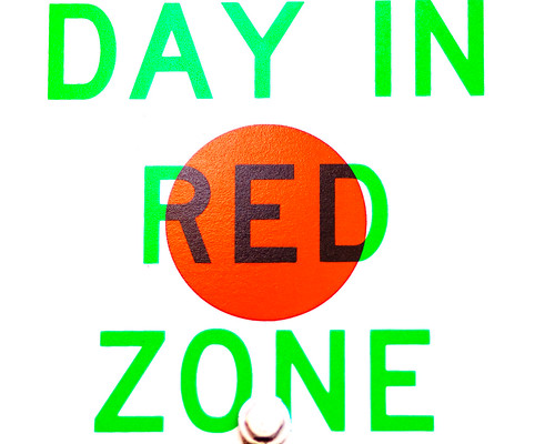
So there I am, in Savannah, under assault from all sides by red. I shoot some signs, I shoot some brick walls. Then I start noticing the words within the words that make up signs. Suddenly a 'For Sale' sign has the word 'ALE' in it. I can 'dig' a digital camera sign. I started shooting ideas based on extracting hidden words. All from red signs. Still the original theme, but now it has evolved to be another, more focused concept. I was trying to push myself along and had been having a tough time, so I started shooting some positive statements. I've dabbled in NeuroLinguistic Programming and the power of positive thoughts and while I struggle to accept some of the underlying ideas, it tends to work. Sometimes if you fake it long enough, you'll start to act that way anyway. So, I shot positive messages. I even put myself into one of the images to tie it back more personally to me.

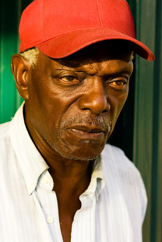
Next thing I know I'm approaching a stranger with a great face and a vivid red hat. The bonus is, he's standing in front of the perfect colour compliment: a green wall. I figure I'll just be honest and tell him - I love the colour of his hat. Leading with that easy, honest gift of a compliment breaks the ice. We start talking from there and he is kind enough to let me shoot several shots of him, even allowing me to move him a few feet to take best advantage of that great colour background. Harold's cap capped off a great morning working with an unfamiliar colour for me. I know I wouldn't have spoken with him or photographed him, if I hadn't started out by throwing away my favourite colour for a few hours and trying something new. I'd be off in the cool blue shadows alone, not talking to someone new in the bright, direct sunlight.


1 comments:
I must say that your posts are simply inspirational. Reading through and watching your thought process for capturing images and colors is just amazing. Great work Gordon!
Post a Comment