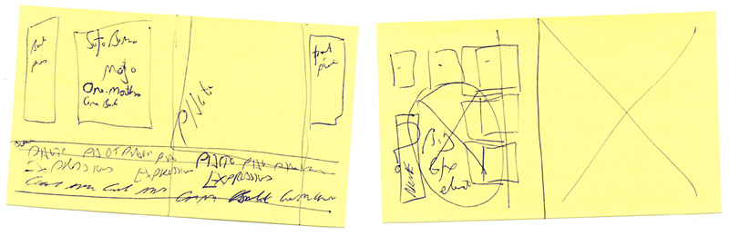
My first fumbling explorations for SoFoBoMo with InDesign yesterday evening left me with some idea on how to use that tool, but with no idea on what I really want to lay out. I've got a vague grasp of the nuts and bolts of how to put whatever it is together, but no idea on what
it is at all. Currently I'm at the scribbling on post-it notes for ideas stage, trying to brainstorm layouts - the one above is a potential cover idea. After a bit of twiddling around in InDesign I produced a first pass at the front cover. The next step I think is to start trawling through photo books in my collection to get ideas and layout pieces for inspiration/ all out theft. I've worked through most of the sizing and export sort of concerns so I know how to get a book together in PDF form and out to blurb.

I've also tried a few permutations for the interior page layout. Haven't really got to grips with what all the pages are around the main content and what the front and back pieces of a book should contain or even look like. Then of course there is the issue of writing some content for an introductory essay, to at least set the scene. Oh, and of course, the pictures to take. That whole month is stretching out in front of me! Plenty of time I'm sure.

Suggestions for improvement, feedback, modifications and comments are really welcome for these - I'm making it up as I go along right now...


2 comments:
Well, I don't know what to tell you except that layout of Zion is PERFECT! Very nice, indeed. I also like the cover, as well.
Great job, Gordon. Very clean and attractive.
You had cracked a joke about designing something that looked as if it had been done by a three-year-old. That's some talented kid!
Terrific, dynamic layout. The look certainly makes me want to turn the page. Obiously you are getting along just fine with InDesign.
Post a Comment