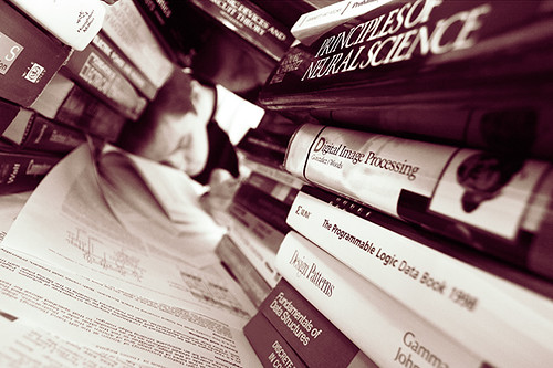
sofobomo : I've never looked at a book before
I only realised this this evening after some time spent looking at a stack of photography books as objects. For the first time I was looking at them as pieces of design, rather than an invisible means to transport the content. Typically I look at what it is in a book, or read the contents of the book. I've never before paid much attention to how that was all put together.
Almost all of my photography books have three title pages. The first page is usually blank, typically a binding page of some sort of heavier card, coloured to key off of the rest of the book design. Then there is a plain title page. Just the book's title, set in whatever font is being used to thematically hold the book together. Not usually anything fancy, stark. Lots of empty space. The next page typically repeats the title and adds the photographer's name and other credits. Maybe the author of the included essay is mentioned. Sometimes this page has the copyright and Library of Congress information on the facing page. Other times there might be a blank page. Maybe a dedication.
Typically, that dedication gets placed on the next page, again out on its own. Must be important that bit, to get all that space and attention.
Then we are off, into the book proper. There might well be an introductory essay, explaining the point of the whole thing you've got in your hands, then the pictures follow. At the end, we might start getting into technical info about the book. Perhaps a colophon provides insight into the typesetting and other design aspects and then we are done.
The inside of the cover typically also has some blurb about the purpose of the book in the front flap, which occasionally bleeds over to the rear flap. Otherwise that rear flap is where the biographical information lives. A picture of the photographer. A potted history of the main creator, then in to any other authors, editors or contributers.
Beyond that there is typography. What font to use. How to relate them to the content and to each other. How white space is used, what text is combined with the images. Graphic elements within each page. How to number pages. How to title images. Should there be any clues to what's going on or how it was done ? Lots of decisions to make.
My only goal is that by the end it shouldn't look as if I did it all in MS Powerpoint, unlike my previous three attempts.


1 comments:
Gordon, there is a very good book that explains all of this, including front and back matter, fonts, etc. It's called Book Design and Production: A guide for Authors and Publishers. It's by Pete Masterson. It's an excellent book. I'm using it as a guide to build my book. It even has a chapter on putting together a book using Adobe InDesign.
It even includes a chapter on selecting a company or person who will do your printing, how to make a book cover, types of spines, etc.
Post a Comment