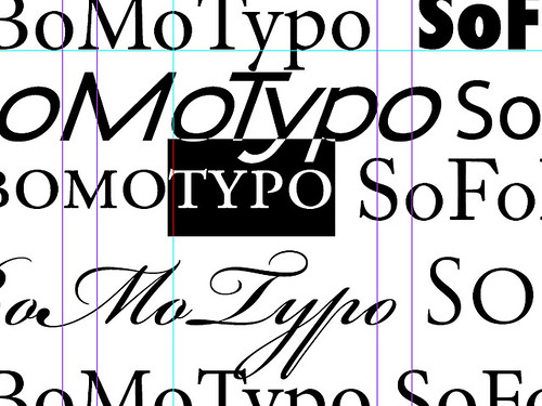
sofobomotypo
I've been learning a bit about typography and layout for SoFoBoMo. There's so much to take in! Over the weekend I read the Non-Designer's Type Book by Robin Williams. The biggest crisis of choice I'm being faced with is the vast variety of fonts I can choose from. I think I'll just have to pick a couple and get on with it. The basics are simple, sans serif for titles and better legibility, serif fonts for larger blocks of text that need to be readable. But there are so many choices!
Then there is all the more subtle details; using old-style numbers, kerning, small caps, ligatures, appropriate em dashes and quotes. Adjusting the paragraph and font alignment, hanging punctuation. The way a serif font letter 'a' changes to an enclosed 'a' in the italic version, but the san serif 'a' doesn't change for an italic serif font'a', just slanted. Many of the features that differentiate a layout tool from a word processor. Details that I was never aware of before, but now I see everywhere as I read.
This sort of selective revelation has always fascinated me. Growing up I'd never seen a sun dog. Never even knew what one was. It wasn't through lack of opportunity- I spent a lot of time watching clouds float by. A few years ago I read a book about atmosphere and effects. It mentioned sun dogs and I thought they must be some sort of rare, hardly ever seen event. Amazingly, the day after I read the book, I saw one. Then I started seeing them every few weeks. They'd always been there - I just didn't even know to look for them, so I couldn't see them.
I think this happens with photography too. Until I was aware enough of sharpening halos and other sharpening side-effects, I couldn't even see them to tell if they were right or wrong. I can look back at early pictures that I thought looked perfectly fine and now see all the issues. I couldn't even see those problems at the time I made them - I wasn't aware. But once you become sensitive to them and aware, then you can start improving on those features. The awareness is the key. The use of rhythm in composition, or layering or other compositional ideas is similar. Before I knew to look for it, I might know an image was more compelling, but couldn't divine why. Once you have the language and awareness to go look for the features, then you can understand what is going on. Only then can you start intentionally using it in your own composition.
I now have a much better awareness of typography, that I didn't have before. Hopefully I can apply it to my SoFoBoMo book!


4 comments:
"The basics are simple, sans serif for titles and better legibility, serif fonts for larger blocks of text that need to be readable"
Okay... I read that and then I look at your cool graphic atop the BlogSite.... Up there where it sez, "Photo Expressions" and I go... "Duh!"
This isn't critical... Nope, I've read that advice that Williams gives as well. And yet, your logo work up there in that intro box works so well. Hmmm... is this the exception which proves the rule?
Inquiring minds want to know.... or... no. :)
Hi Ted, thanks for the on point comment :) A few thoughts:
I didn't know any better when I did the original design for this blog. I've actually been thinking about reworking that title block as a result of some of the books I've been reading. I seemed to have hit just about all the things Williams recommends against :)
block capitals, serif fonts, non-contrasting sub headline, centered, box around it, another box around it. A veritable buffet of newbie design cliches.
Maybe that's why it works, they all combine together to overwhelm one or the other being bad, and poke out the other side to being good again.
I'm not too sure that a blog title has to be that legible, really, either - you aren't scanning the title quickly to find a spot of text. If you are coming here, you probably are more interested in the articles (I hope :) ) than the blog design.
I might get around to reworking it soon. Maybe.
Thanks again for pointing it out.
It's funny how synchronous the web can be sometimes. Yesterday this was in my reader:
ilovetypography.com/onchoosingtype
And today your post about type comes up. I really like ilovetypography.com, I hope there's some useful info for you there. Although, it does sound like you've already studied a lot about type.
Cheers,
Dan
Thanks for the link, Dan
Post a Comment