easy questions about finding light
On this post, Mark asks a question:
How do you get Amanda exposed so nicely against such bright background colours? Or is it that there wasn't strong sunlight coming off the yellow background, so it didn't underexpose Amanda?
A good question without an easy answer. On the day, I put her in light that I thought would be good - didn't give it much thought at the time. That's an easy but mostly useless answer. Thinking about it more carefully, I put her in light that I knew would work well within the limits of the particular camera I was using. I was, as my friend Randy would say, in the pocket, shooting within the dynamic range that the camera can work with. I suppose I've learned where that is by taking a lot of bad pictures and looking at those results.
Maybe more usefully, these particular shots were taken on a bright, sunny day, but in open shade. The walls are in shadow, with the sun the other side of the buildings. Amanda and the walls are both facing away from the sun towards the open sky - bright day, lots of even light. Randy again describes the situation of finding light as going to where the light isn't, and looking the opposite direction. You find good light flooding in from there. Be in the shadows, and shoot with the subject facing the light.
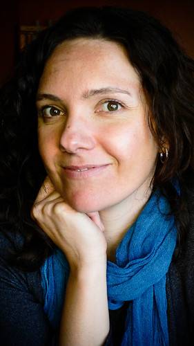
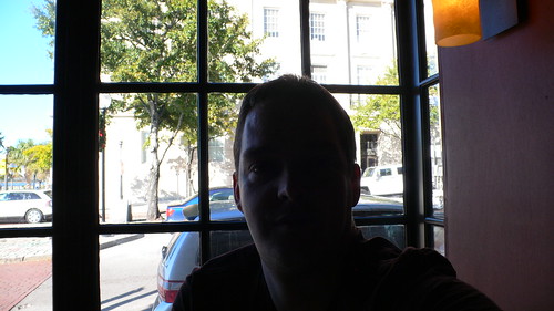
One part of this is learning to see how your camera sees a scene - rather than how your eye sees. Sitting in a cafe, having lunch at the weekend Amanda & I were playing around taking pictures of ourselves. We were sitting up in the window of the cafe. Lots of light, a big window that faced the open sky, without any harsh sunlight. The window faced to the North (which is always a great window to use in the Northern hemisphere for portrait light). A generous woman at the next table offered to take our picture and we accepted her offer. Immediately she wanted to pose us with the window behind us, because 'the street outside was a more interesting background'. The only problem was the great light for portraits was coming in the window she wanted to put behind us. I suggested maybe we'd shoot it the other way around and she was happy to do it - maybe somewhat confused why I wanted to have the picture with the boring solid red wall of the cafe behind us. The same situation here - the light was outside, so we faced it. Also, the shot was taken with an appreciation of what the camera can do and how it sees light, rather than how our eye sees it. I snapped a quick shot of the alternative direction, just to show what it could have been like - bright, well exposed outside world, black silhouette of me. I could bias the camera to expose for me in the middle, but the window would be totally blown out. Shooting against the light (contra jour) can provide great results, but for portraits, I tend to like quite quiet, simple light. The other solution is to add light to the scene - with a flash or other light source, but the on camera flash is terrible on a small point and shoot and these are just quick snaps.
So the simple answer to Mark's question is have the subject stand in good light and orient them appropriately for the light source (the sky in both of these cases). Watching the background helps a lot too - keeping it cohesive with the subject - that doesn't necessarily mean bland or boring, but hopefully building on what you are trying to express, rather than fighting with it. Dealing with the direct sun is tough, so in both cases, I just avoided it - being in the shadow of the building in one, or using a North facing window in the other. Becoming sensitive to these sorts of things takes some careful attention to start noticing how shadows fall and where light is coming from. It also takes some experimentation to get familiar with how your camera sees a scene compared to your eye. All things that can be learned with a bit of focused practice.
I've got a part-finished sequence of images and comments that might give a bit more insight into how I try to find these sorts of locations with just ambient light and subject placement. Some day I want to go further with those examples. Maybe that's SoFoBoMo II or another book.


3 comments:
Look at me! I'm mentioned in TWO posts now!
Okay, enough gloating....
So my assessment was, in part, correct. There was strong sunlight, but it was reduced by the building and therefore not shining directly upon Amanda and the background. I'm guessing that means you had lots of good ambient light? Am I using that term correctly here?
I seem to have more problem with lighting than anything else, but I'm trying to pay more attention to what I'm doing and what folks, like you, suggest.
Thanks for answering my question...it has been illuminating!
Hi Mark - the questions help - they make me focus on things that I might not have really thought about at the time - so feel free to keep asking as many as you like.
You are correct - there was good ambient light - in fact, it might have been a bit too bright if she didn't have the sunglasses on.
The thing that was absent was direct sunlight - we were in bright, open, shade. Direct sunlight would have increased the dynamic range in the scene - making probably for blown highlights or really dark shadows. (which can be used to great effect too)
This series of Amanda portraits are a terrific example of making excellent use of light and color. I love the way you have produced the juxtaposition of warm and cold. While Amanda's clothing clearly indicates cold temperatures, the intense colors create a sense of heat. Put that together with her gestures and there is tremendous energy in the portraits. A great lesson.
Post a Comment