Wednesday, March 19, 2008

dawkins

dawkins

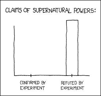
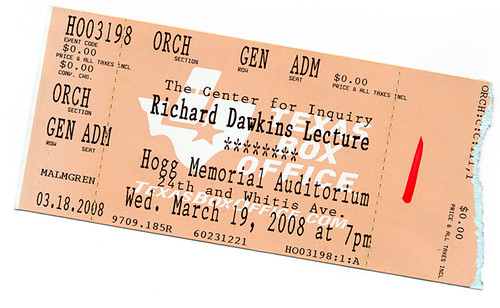
How I spent my Wednesday evening. I turned up at 6:30pm for the 7pm lecture. The lines stretched across the UT campus - I was quite stunned by how many people had shown up. I bumped into a couple of people I knew towards the front of the line who mentioned that the queues started forming to get in around 3pm. I didn't have a ticket - I expected a half empty auditorium and a few unenthusiastic people picketing the event. I meandered to the back of the line and didn't expect to get a ticket or a seat. Eventually the word filtered back that the place was full, nobody else would get in. We shrugged and headed towards the car. Along the way we noticed more people than expected had also given up, leaving quite a shorter line, so we jumped back in towards the back. Somehow, some way, SJ batted her eyelashes enough to get us VIP entry tickets (apparently a red slash means a whole lot in these cases - take a red pen everywhere). We got to jump ahead of all the other people still in line. We got ushered past most of the already seated students down to a few rows from the stage. Funny how that works. The presentation was interesting but nothing new if you'd read the God Delusion - in fact I think this is probably a book tour, for the paperback release, in disguise. Dawkins is an articulate, engaging speaker, not unlike many of the professors I was lucky enough to learn from growing up. I do tend to think he's a better evolutionary biologist than an atheist evangelist, but that didn't seem to be what most of the audience were there for. The dribbley combination lock analogy for how natural selection works was painful. There's dumbing down then there's insulting the audience. Surely he has a better analogy in his many books ? I was amused to note quite a few disappointed looking members of the audience as I left - almost as if they'd been expecting some sort of religious experience. The highlight was possibly being one of the 5 people in the packed auditorium who knew who Ant & Dec were and why they should never be apart. No fights broke out. The questions from the audience were fawning and a bit rambling. All in all and entertaining lecture that I didn't expect to be able to get in to at all. Still the best argument:

trial balloon: experiences with blurb.com

I've been ruminating on a couple of book ideas; for SoFoBoMo and another in progress and wanted to try out blurb.com as the printer. They seemed like one of the few PoD companies that would do decent photographic prints while also being geared up to at least allow some resale. I have a notion of creating a teaching book that people could purchase and blurb.com might well be a good outlet. I can revise and update the book as I go along, releasing new versions and potentially if there is interest use it as an avenue in to showing a publisher. I've tried other PoD companies, such as lulu.com and was very disappointed in the print quality. I've actually seen blurb.com books in person at trade shows and was reasonably impressed. The booksmart client software that they provide is not terrible. I don't relish the idea of authoring a book with much text in it though - in terms of desktop publishing support it is pretty basic. I think I'll use Adobe InDesign for layouts, then just paste full-bleed pages into blurb for a final print version. However, for this sample, I took a simpler approach. One picture per page, full bleed with a black background for the remainder of the page. I picked a somewhat funky font, made it large and kept things simple. For the book, I picked the cheapest hardback sample that I could put together, 7" square book, with about 15 pages - you could do more pages for the same price - up to 20 for the cheapest book - then you start paying an incremental cost per page. As this was a trial, I thought that would be enough. I selected and edited the images in Lightroom then exported them to Photoshop for a final tweak and colour profiling. The one thing I have heard are lots of horror stories about bad colour from blurb and other PoD companies. I'd found a colour profile for their printer and picked a challenging image for the cover - bright, lime-green with magenta highlights. Perfect. I switched on the soft proof in Photoshop and the defaults looked terrible. Muddy sickly yellow. Anemic colour, flat highlights, muddy shadows. But with a bit of tweaking, some selective colour adjustments to move away from the real lime green to another apparently printable green and some additional contrast, things were looking much better. I went through the same process with all the images, doing some radical adjustments to the original image, just to get it back to close to how I wanted it in the soft proof. That always concerns me, but I thought I'd go along with it.
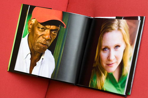
Assembling the book was straightforward in booksmart. I uploaded the final version after some previewing and bought a copy. Surprisingly, the book shipped only a couple of days later - I'd expected a longer lead time. The book arrived in decent packaging, quickly and without any problems. There I had it, a few days later, a book of my photos! First thing is to notice how fantastic it is to have a hardbacked book of your images. There's a certain thrill to that that is difficult to replicate with online displays or even individual prints, mounted and framed or not. I know all I did was pay some money, there's no real validation involved, but it sure looks good! I've put together a few books for different purposes and the feeling hasn't gone away yet. The second thing to note is that 28 sides (14 pages) isn't very many. You end up with quite a slim volume, particularly in hardback. All cover and no content, if you aren't careful. The slip cover looked great - particularly that green I'd been worried about translated very well, close to how it looked in the soft proof. I'm impressed with how similar it all turned out - throughout the book. On the other hand, I think if I'd uploaded straight, unadjusted sRGB versions of the files I would have been quite disappointed. Some of the original colours just wouldn't have worked out at all. Blurb doesn't make a big deal out of mentioning this - it is there on their site, but they certainly don't push colour management and soft proofing. Something to watch for. The print quality is certainly not as good as I can get from my inkjet (an Epson R800), but is certainly well above acceptable on most of the images. There is a slightly visible cross-hatching in the smoother areas of some images, if you look particularly closely, but from a normal viewing distance all of the images look great. Some of those that were slightly less sharp than others really become more noticeable on the printed page. Also higher ISO black and whites lost a lot of the presence and depth that they have online. They just don't translate too well, the noise becomes more noticeable, the contrast isn't as strong and they just don't have the same amount of life. The one disappointment for SoFoBoMo is that booksmart isn't a simple way to get a PDF of your book. At least, not without a large watermark through each page. using pdf995 I was able to get a final PDF of the book from booksmart, but the layout is not great and the watermark is very visible. Might do in a pinch, though. I also made one rookie mistake, putting something too close to the edge of the slip cover. The cropping is probably about a quarter of an inch tighter than the previews - certainly you are well warned about this but I almost lost an eye from the cover! This particular book has a bar code printed on the rear. From blurb's blog it appears that different printers and different books may or may not end up with this bar code. I've also read that all of the books larger than 7" are printed on a slightly better printer, so the quality should improve even over this quite acceptable start. The binding seems solid, the book feels like a real book. The pages appear to be glued and stitched into a cloth-backed hard cover. It all looks professionally put together, though a bit skinny. A 14 page book cost $22.95 for the 7" hardcover, plus $8 shipping. It is the same price, up to the first 40 sides. Note that blurb refer to pages as each side of one physical piece of paper being one page for the cost calculation. An additional $3 doubles the page count and the book would start to feel more substantial. White space is your friend. Overall I'm happy with the results and plan on using blurb for a final copy of my SoFoBoMo book.

Tuesday, March 18, 2008

the great cheese race

Amanda will attest to my love of cheese. This event is one of the things I'd love to participate in or photograph. Some day.

photography. book. now.

wildflowers

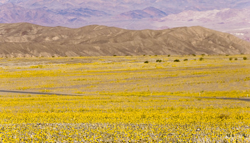
If your SoFoBoMo book happens to be better than just good enough, this might be an interesting home for it. Blurb just announced the PhotographyBookNow contest. Closing date is July 14th. Rules and FAQ didn't look like some sort of rights grab, at least at first glance. The photo ? It's another one from Death Valley. I've never seen it look like this before. A dramatic change from the rock and mud I found on the last trips. I feel lucky to have turned up at the right time, mostly by accident of birth.

good enough

enchanted forest
SoFoBoMo. What seemed like a great idea when it was several months (and fuzzy months at that) away is now starting to loom large. Angst ridden posts about not good enough ideas or concerns about not good enough pictures that haven't yet been taken are popping up on the blogs of the various participants. It seems to be a stressful time to be called Paul in particular. I'm not called Paul, but I am starting to feel that same will it be good enough pressure. I haven't even taken a picture yet and I'm writing off the images as somehow not worthy or the concept too boring for anyone to want to see. Perhaps I'm more concerned that people will actually want to see it, then get disappointed when they do. Fearing the work isn't good enough before the first shot is taken - isn't that where procrastination springs from ? Aren't these the exact feelings that SoFoBoMo is geared to helping us move through ? The deadline is real. The deadline is short - so we'll just have to get on with it regardless. No chances to third or fourth guess the book concept (I'll leave a chance for a first, second guess of it after a few days and images). No real opportunity to find that you don't have enough pictures and need to reshoot for months on end. You've either got the pictures or you don't. If you take them, I'd suggest that they'll be good enough. Good enough should be the motto for SoFoBoMo. Not perfect, not your best work of a lifetime, just good enough. Good enough to pull together and show to people. Good enough to wrap up into a book. On the flip side, it will all have been put together in only a month. You can always use that as the excuse for why it isn't amazing. If it is amazing, then that is even better, but good enough is better than didn't finish, or gave up half way. I'm feeling my own doubts and concerns. This pep talk of a post is aimed more at myself than anyone else. I have to find 35 people. I have to find and ask 35 people. I have to find 35 people, ask them and have them say yes. Then the pictures actually have to be any good. So that probably means asking 70 people, for all the upfront rejection and subsequent rejected pictures! It'll never be good enough. Must be time to write my own angst-ridden blog post about SoFoBoMo and changing my idea. But I'll find the people. They'll say yes. The pictures will work. It'll all be good. SoFoBoMo. It'll be good enough.

Monday, March 17, 2008

work in progress

Austin

There is a SoFoBoMo group on Flickr now, if you want to share your images and the process as you go along.

Saturday, March 15, 2008

sharpie

sxsw

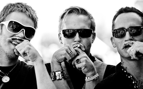
Every year Austin stages the South by Southwest music conference. The place gets invaded by thousands of bands, music reps, journalists and photographers. Sixth street turns into a zoo. Good place for pictures! I never did find out why they'd given themselves sharpie moustaches...

Friday, March 14, 2008

happy π day

train car detail

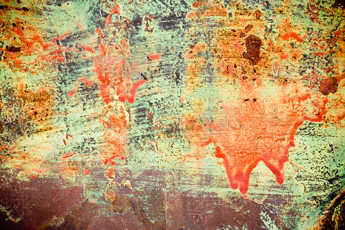
Yes, sadly enough, I waited until exactly this time to post it too. Here it is to the first million places for starters.

ghost rider meets Venus

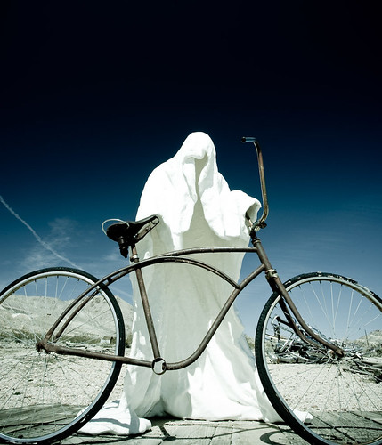
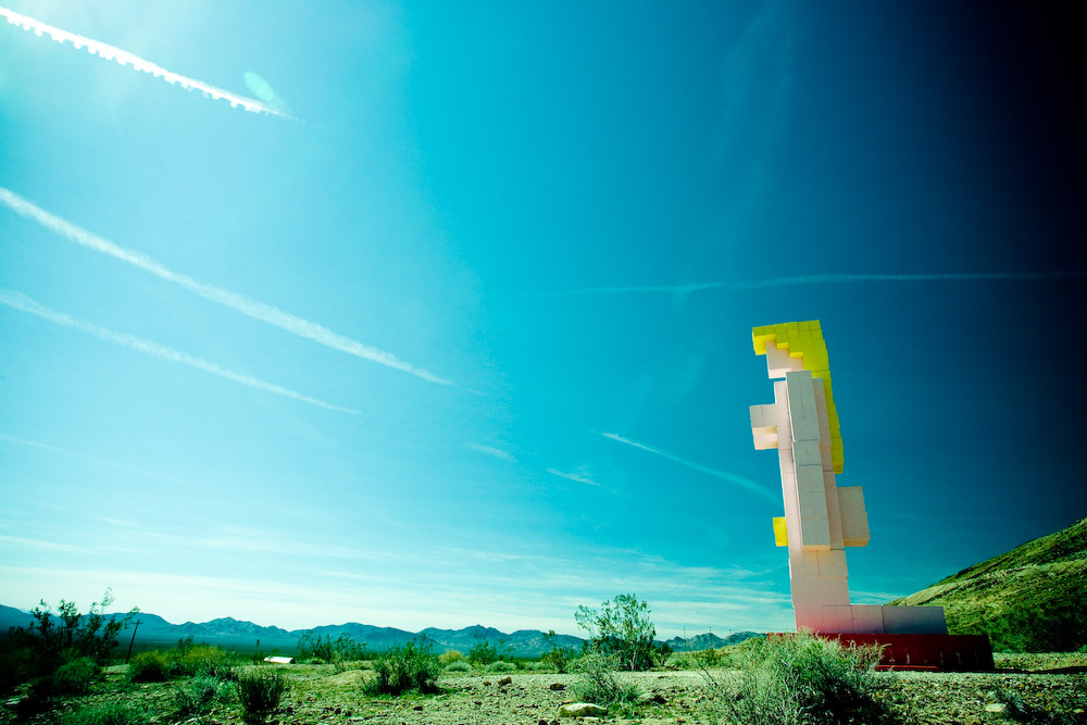
I should probably do something about the rather harsh posterization going on in the Lady Venus shot above. Pushed the colours quite far in Lightroom. That's the one thing I miss in LR, the ability to easily fix up things like that with a lasso and some Gaussian blurring + noise/ dithering. I'd probably also burn down the left hand side to balance the more polarised dark sky on the right. I love what the polariser, combined with the bright desert sky and low angle is doing in the ghost rider shot. I did drag it a bit further to the dark side too, feels like it fits with the theme.

Wednesday, March 12, 2008

zabriske

zabriske

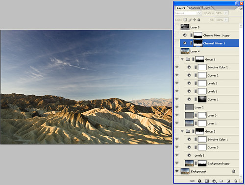
Got up early on the first morning and went to Zabriskie Point. Never really been that enthused by the view out over Manly Beacon (to camera right). It always seems a bit uninspiring when I've been there. This time the badlands off to the left were more interesting, particularly with the cloud formations overhead. I'm interested in comments on this one - I'm not entirely convinced by the composition.