
The right background
 One thing that I notice again and again in the portraits that really work for me is that the background works for the subject. Nothing worse than a background that doesn't fit. The classic problem is the lamppost growing out of the head, but other elements in the background can distract from the subject. Areas that are too bright, or too jarring and different a colour. Add shapes that point out of the frame or lead the eye away, or just strange breaks in the scene that don't flow with the posing of the subject.
For the shot above, I'd seen the fantastically coloured fish on the wall while out running. I really wanted to use them as a background and was thrilled when Amanda had a top on that really fitted in well with the colours and would be complimented by the blue watery walls. I framed her in this shot with the fish to act as something of a halo, with the blue providing the outer parts of the frame for a really bright, colourful result. This was shot fairly late in the day so the warm sunlight, filtering through clouds was low and even but warm enough to add even more to the scene.
Shooting with a wide open aperture has softened the background enough to give some separation with the shapes and colours and I think leads to a really effective frame. I keep trying to keep my eyes open for effective backdrops for portraits. As I'm trying to get up the courage to work with more people, I think having a great concept in mind and telling them about it will be a great 'in' rather than walking up and announcing straight away 'I want to take your picture!'
One thing that I notice again and again in the portraits that really work for me is that the background works for the subject. Nothing worse than a background that doesn't fit. The classic problem is the lamppost growing out of the head, but other elements in the background can distract from the subject. Areas that are too bright, or too jarring and different a colour. Add shapes that point out of the frame or lead the eye away, or just strange breaks in the scene that don't flow with the posing of the subject.
For the shot above, I'd seen the fantastically coloured fish on the wall while out running. I really wanted to use them as a background and was thrilled when Amanda had a top on that really fitted in well with the colours and would be complimented by the blue watery walls. I framed her in this shot with the fish to act as something of a halo, with the blue providing the outer parts of the frame for a really bright, colourful result. This was shot fairly late in the day so the warm sunlight, filtering through clouds was low and even but warm enough to add even more to the scene.
Shooting with a wide open aperture has softened the background enough to give some separation with the shapes and colours and I think leads to a really effective frame. I keep trying to keep my eyes open for effective backdrops for portraits. As I'm trying to get up the courage to work with more people, I think having a great concept in mind and telling them about it will be a great 'in' rather than walking up and announcing straight away 'I want to take your picture!'
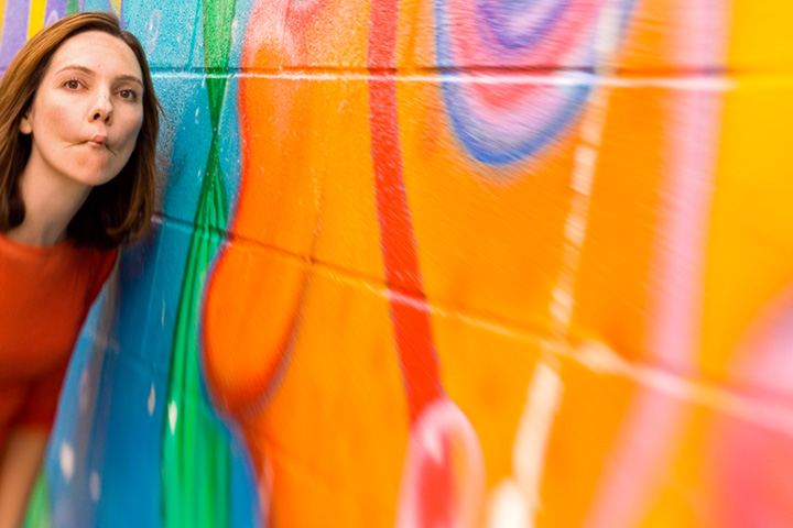 The second shot is with a lensbaby, with the second most stopped down aperture ring thrown in. I wanted to use the leading lines of the bricks and the fish for a foreground splash of dramatic colour. Amanda was obliging enough to pull her best 'fish face' to fit into the bizarre theme!


1 comments:
Love the pic - Amanda looks awesome!! Fish face - maybe not her best look ;)
Post a Comment