Athlete lighting test
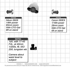
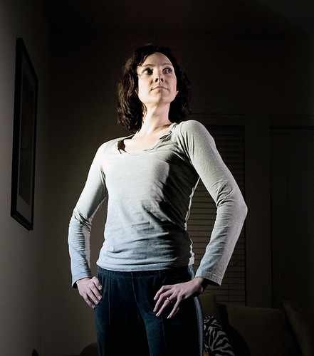
Lens & lighting test shot for 'ironman' portrait project. Aiming for typical heroic athlete poses, with cross light, almost at 90 degrees to the camera, on both sides. Comments and suggestions on how to improve this are very welcome. Note - this is just a lighting/ lens test, the subjects will be in slightly more typical athletic gear for the actual shoots, and outdoors! But I do want feedback on the camera position, lens choice and light location/ modifiers if anyone has thoughts or suggestions. Thanks to Amanda for letting me put this unprepared test shot out for comment.
Both lights have CTO gels and the intention is to shoot these actual portraits outdoors, with tungsten white balance to blue out the backgrounds. Also, planning on exposing the ambient backgrounds about -1EV below a 'typical' exposure to further emphasize the subject. I burned down the background a bit on this shot - I think I want to darken it more by controlling the ambient when setting up - again, suggestions very welcome! Lighting was two strobes, at not quite 90 degrees to the camera, with full CTO gels, on 6ft stands, fully extended. I had card flags on the camera side of the strobes to control any spill into the lens, but no other modifiers/ snoots other than that - suggestions for something to use ?
Lens is a 17-40 F4L, at 40mm, on a 1DII (52mm effective) though I might shoot wider than that, still playing around with lens choice for this.
Camera position about waist height to the subject, to give something of a more imposing feel to the portrait. I feel it is a bit too much 'up on the nostril' at this angle, so I'm thinking of raising it up slightly - or maybe it is something I need to work with on the posing ?
 Lighting was two strobes, at not quite 90 degrees to the camera, with full CTO gels, on 6ft stands, fully extended. I had card flags on the camera side of the strobes to control any spill into the lens, but no other modifiers/ snoots other than that - suggestions for something to use ?
Lens is a 17-40 F4L, at 40mm, on a 1DII (52mm effective) though I might shoot wider than that, still playing around with lens choice for this.
Camera position about waist height to the subject, to give something of a more imposing feel to the portrait. I feel it is a bit too much 'up on the nostril' at this angle, so I'm thinking of raising it up slightly - or maybe it is something I need to work with on the posing ?


2 comments:
You know, before I even read the text below, I looked at the picture and thought of the more "athletic" shots you see in Gatorade ads and the like.....so I'd say you've got that lighting down! Looks like the lighting would accentuate muscular physiques in a very flattering way. Can't wait to see it all in action!
G,
I think you're definitely on the right track with your lighting here and I have no doubt that you will get the most out of your subjects. I'm looking forward to seeing your results.
Since you are soliciting suggestions, I'll offer my opinion on a couple of things:
You might try raising the main light (8-10'?) and aiming it down onto your subject and letting it fall off as it crosses their body. It might even be worth making some sort of snoot or grid to make the light even more spot-like. It might also be interesting to have the fill somewhat cooler than a full CTO, maybe 1/2 or 3/4 CTO.
It's your vision. I'm just thinking along the lines of the clouds breaking open and the "God light" shining down on the hero. You can decide if any of this is worth a try.
As for the up the nose angle, you could raise the camera a bit and still get the heroic subject look. It might also be worth trying poses where the subject's face is not dead on to the camera.
Post a Comment