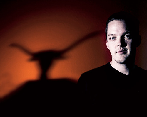
UT Gobo test shot
Trying out an idea that I have for a portrait of a friend of mine. He's a bit of a UT fan so I have this concept with a burnt orange background and longhorn gobo for the shadow and then lit myself with another unmodified strobe. Light on the subject will need to be a bit better controlled for the final shot but may well be natural light, rather than a second strobe, if I can work the angles out properly. This was really just exploring the potential for the background graduation and shadow effects, which I think have worked out quite well. The large dark area under the gobo UT logo is caused by the cardboard I'd mounted the cut-out in. I'm going try using a plamp for the next test. A plamp is an articulated clamp arm that is thinner and more controllable. It should also give a fairly easy to edit shadow for the final shot.
 Settings:
Canon 1DMk II, 1/250s @ f5.0, ISO 100. 17-40mm F4L at 33mm.
Set the camera at the max sync speed (1/250s) then adjusted aperture and background flash power to get the sort of shadow brightness I wanted. Brought in the second key light and adjusted the power levels on that appropriately too. More details are in the lighting diagram. Custom toning is similar to the rest of my 'friends photo project' which semi-desaturates the skin-tones.


7 comments:
Interesting idea and lighting diagram. Your whole blog site is quite interesting.
This photo looks like it will work well with your model. The skin tones may be a bit off in your test photo, but otherwise this looks good to me.
Great job and thanks for the explanation of the shot, I'll remember that when I want to experiment.
I really like your diagrams its a lot like those photo books I love to absorb myself into. The first thing that caught my attention was the shadow and honestly it looks like bicycle handlebars to me. After your explanation I got it, but still couldn't get the bicycle image out of my head. LOL I'm looking forward to learning more from you.
I like this. I also appreciate you including the lighting diagram. That's a great learning tool.
I agree with Jeff about the skin tones, but it may be also a matter of taste. Your skills are great as well as your creativity. Your blog is full of usefull information.
Spooky effect from the skin tone on you, Gordon, but you're such a cutie - this is a very nice self-portrait of you. I really appreciate the detailed descriptions you give of your setups.
Wow the diagram is so cool. I really like that we can clearly see what you are using. Nice work!
Post a Comment