Thursday, August 30, 2007
Thursday, August 23, 2007
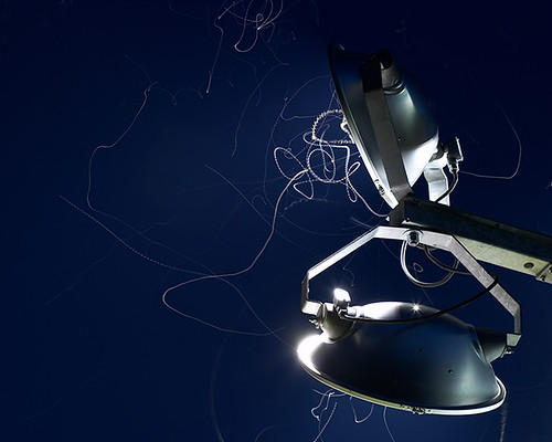
Me time and the fireflies
Posted by
Unknown
at
6:26 PM
1 comments
![]()
Labels: Austin, creativity, inspiration, process
Tuesday, August 21, 2007
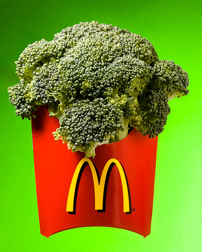
Do you want fries with that ?
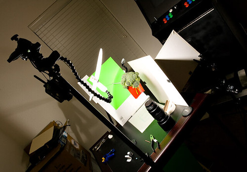 The final tricky part of this shot was getting the whole scene to float. I bought a 3 foot metal bolt from Home Depot (about $1.50) and some washers and bolts. This was attached to a tripod with ball bungee cords and poked through the background green paper. The fries packet had a hole punched in the back and was bolted to the rod, which was also pushed into the back of the broccoli to hold it all in place. A few additional pieces of broccoli were squeezed in to fill in any gaps. You can see more of the setup from a slightly crazy angle, on the right.
Posted by
Unknown
at
8:17 AM
0
comments
![]()
Labels: backgrounds, colour, contests, creativity, lighting, process
Thursday, August 16, 2007
Puzzling it out
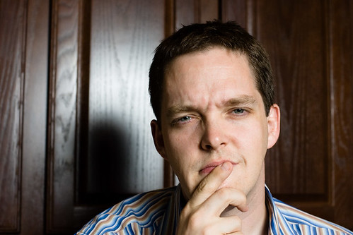 The latest Strobist lighting102 assignment is to play with using the specular highlight as a background element, while lighting the foreground subject. You can see one of my early attempts here, with a strobe in a silver umbrella to the camera right and high up. I think this has worked out reasonably well, even with my confused look. The only real issue I can see is th shadow my bonce is casting into the specular highlight on the wood behind me. Next time I'll need to be a bit further from the background or change the flash angle slightly.
This was relatively easy to set up - you can see the highlight through the lens if you trigger the flash while looking through the viewfinder, so it is possible to line things up pretty quickly, even if you are going to be the subject in the photo.
Posted by
Unknown
at
6:02 PM
1 comments
![]()
Labels: backgrounds, lighting, lighting102, portraits, strobist
Monday, August 13, 2007
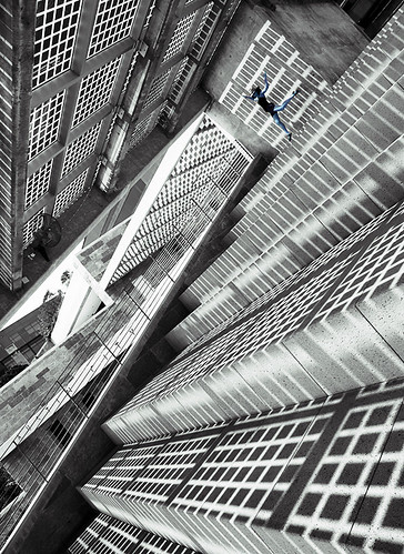
Austin City Hall
Posted by
Unknown
at
7:25 AM
3
comments
![]()
Labels: Austin, backgrounds, portraits, texas
Saturday, August 11, 2007
Putting it all together: Cooking light
Posted by
Unknown
at
10:56 AM
0
comments
![]()
Labels: backgrounds, colour, lighting, lighting102, projects, strobist
Friday, August 10, 2007
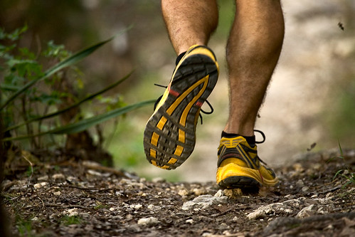
Happy feet & mental cameras
Wednesday, August 08, 2007
Lighting: specular highlights
 This time around I'm playing with controlling the specular highlights that appear on the subject. The specular highlight is the reflection of the actual light source, bouncing off whatever it is you are lighting - in this case it is the white glare or sheen you can see on the pepper mill and also the white reflection on the metal top. Some subjects (such as metal) really only show specular highlights and no diffuse reflections, other's like wood, show a mix of specular and diffuse highlights. These properties of the materials can be used to control the lighting in a variety of interesting ways. I'm also using some of the other tricks from previous lessons to control diffusion and fall off, along with playing with the location and size of the specular highlight.
From left to right, the shots are:
(1) Bare flash to camera left, at the same height as the pepper mill, about a 45 degree angle. Nasty light, harsh dark shadow, bright, narrow specular highlight the length of the mill because the light source is small and non-diffuse. To try and improve the situation (2) I moved the light source to almost directly overhead, but still slightly to the left to give some direction. You can tell this by where the shadow falls on the pepper mill. Now the table is better lit but the shadows are still harsh. The specular highlight has moved to the curved edge of the top of the pepper mill, as this is the direct reflection of the light. There's no specular highlight visible from the table, as the angle of the light, camera and table means it isn't visible.
In shot (3) I've added a diffuser between the flash and subject. The specular highlight has gotten a bit bigger, as it is now reflecting the diffuser. The shadow edges have softened, both on the table and along the edge of the mill. In shot (4) I added a small white reflector to the right of the camera to bounce some light back in to fill the shadows. This doesn't change the specular highlight from the light source, but adds a new specular highlight on the right, which is the reflection of this new light 'source' - the bounce card. You can see that new highlight particularly in the metal top of the mill.
In the final shot (5) I changed the light source from a diffused flash to a flash bounced into a silver umbrella. You can see that the specular highlight has become larger again, reflecting (literally!) the change in size of the light source.
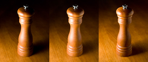 In this sequence, I've gone back to the original light position, at the same level as the object, at about 45 degrees to the camera access. The goal this time was to create a specular highlight that ran the height of the mill. I brought the light in closer to get more fall-off on the background and diffused it to control how harsh the specular highlight was. The second shot, in the middle, brings in a bounce card to the camera right, again to fill in the shadows. Once again, these changes can be reverse engineered by looking at the specular highlights in the metal top of the mill.
Finally after inspecting the shot on the LCD, I decided I wanted to get a bit more definition on the metal top and background, so I moved the light source a bit further away to decrease the light fall-off towards the back of the scene. That added some more light to the background, at the top of the shot which brings the top of the mill out of the darkness. Note that moving the light also reduces the effective size of the light to the subject - so the shadows in the third shot become that bit more defined.
Posted by
Unknown
at
7:36 AM
2
comments
![]()
Labels: lighting, lighting102, projects, strobist
Saturday, August 04, 2007
lighting: apparent size
Posted by
Unknown
at
10:12 AM
2
comments
![]()
Labels: lighting, lighting102, projects, strobist
Friday, August 03, 2007
Lighting distance
Posted by
Unknown
at
7:15 AM
3
comments
![]()
Labels: lighting, lighting102, portraits, projects, strobist
Wednesday, August 01, 2007
lighting: point of view
Posted by
Unknown
at
11:59 PM
0
comments
![]()
Labels: lighting, lighting102, portraits, projects, strobist
Lighting position
Posted by
Unknown
at
8:06 AM
0
comments
![]()
Labels: lighting, lighting102, portraits, projects, strobist

