I've got eight days left to wrap this thing up (that's what I get for starting a bit early I suppose). The drop dead date is next Tuesday but I think I'll have everything bundled together and finished by the weekend. I'm reading other blogs and suddenly remembering about the sequencing aspects of it - this last week I've just been focused on finishing shooting and then creating individual double page spreads. Haven't given any real thought to how those pairs of pages go together. The idea of chapters had drifted out of my head completely. I think I might have two broad sections to group the people into and that's about it. Shooting is done. InDesign template and page design is essentially done.
Colin was
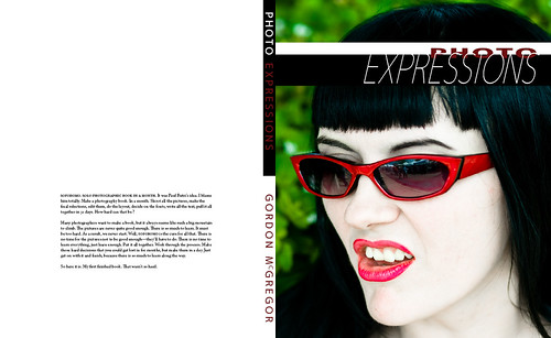
talking about covers. I realised over the weekend that I probably need to do three versions of the cover. There's the general layout out of the front page to think about, but then there are different versions - the web version that will represent the book, that hopefully people will click upon. Then there's the front page for the PDF version. I have some 'dust jacket' text that I want to place there, at least it'll be on the back of the real book - but should it be on the 'back' of the pdf ? On the left of the cover in the way it would be printed and wrapped around the book ? It is something that really should be read before reading the rest of book - should it get a page to itself in the PDF layout, then move to the back page of the real printed edition ? Same with a bio blurb - it'll go on the inside flap of the dust jacket in the real book, but where does that live in a PDF rendition ? Then of course there is an argument to be made for changing the font size between the web and print version. 10pt at 300dpi is a very readable printed resolution. Bit tougher to read at 72dpi on a screen. 12pt at 72dpi is the standard readable screen resolution, but doesn't look anywhere near as good printed. Anyone got thoughts on this one ?
None of these are particularly earth-shattering decisions, but they all add to the things to tweak and get right. The font one might be the most thorny if you are really being picky about the presentation.


2 comments:
Cover?! What cover?!!! Oh, dear! Oh, dear! I'm late! I'm late! for a very important date! :-)
I haven't even considered a cover or, for that matter, a final title. I have a working title, but I'd like to have more. Oh well, when I get it all put together, maybe I'll look at it and then decide what it should be named ... hopefully, not Frankenstein!
Sweet! My only feedback for the cover might be the color of "Photo" and the placement of "Photo" on the front page. I'm not sure how it would look in print, but that maroon is hard to read against black. If you were to use that image on the final version of the cover, I might consider using some color from her glasses to get the text color for "Photo". That, and move the "Photo" text up into the white space entirely. It's distracting where it is now. Hope that helps.
Post a Comment