Wednesday, February 28, 2007

Ideas vs Reality

Flow

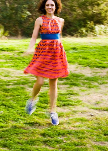
A somewhat flawed attempt at shooting with a lot of motion in it. I loved the colours in the latest dress that Amanda got, so wanted to shoot it with a vivid green surrounding, to really set off the orange & blue. I had this idea in my head to try and capture some motion in the dress and blur in the background, along with Amanda moving. Lots of motion & blur, but with some detail and sharp focus - out of focus and motion blur are pretty different things. Something that is sharply focused but moving looks very different to something thrown out of focus completely. The shoes in this shot are a good example of that - sharp but blurry. We went to Laguna Gloria on a very windy Saturday afternoon to try out this idea. On reflection, I think we should have gone a bit later in the day to get somewhat softer light. I also didn't have my head screwed on right, because the longest lens I brought was an 85mm 1.8. If I was looking for lots of background blur and shallow depth of field, something longer would have been a much better choice - next time I'm bringing the 400mm! The second silly mistake I made was that shooting mid day in Texas, on a bright sunny day isn't the most conducive to using slow shutter speeds. I wanted to pan the movement, to further blur the background and capture some of that sharp/ motion feel I mentioned - but that needs shutter speeds down around 1/60s or slower. 1/30s would have been ideal. Then combine that with wanting to shoot close to wide open, again for the shallow depth of field and you have a problem. Shutter speeds around 1/2000s make this tough! Even at ISO50. So next time, a polariser and/or ND would really help to make this shot work. The polariser will help the colours pop a bit more and saturate the way I had it in my head. The photo above has had the colours pushed further than I'd like in post processing, to get close to the idea I had - the polariser would be great in that respect, doing double duty as a 2-stop ND and saturating the end result. I quite like this result though, Amanda in the air, face sharp enough, still lots of movement and it has a lot of the design elements I had in mind for the shot. Amanda did a great job of running/ jumping around after our 18 mile run that morning! It was also just fun to hang out with her on such a beautiful day and do something fun. The kind people in my portrait class really seemed to like this result - even though I had a hard time getting a final print that I was happy with. I think though that what I struggle to accept is the difference between the image on the page and the idea that I had in my head. Some, very few times, those ideas come out in the end result fully formed. Other days, happy accidents occur and you go off in a whole new direction. This is just one that doesn't quite live up to the idea I've got still in the back of my head. I think I'll give this another go, just as soon as Amanda feels up to it.

Monday, February 26, 2007

Daughtry

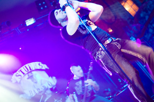
DaughtrySpent Friday night at Stubbs, shooting Daughtry. He's apparently some ex-American Idol contestant that formed his own band and seems to be quite successful. I'd initially signed up to shoot them at the indoor venue at Stubbs, but they sold out and moved to the outdoor stage, then sold that out too.
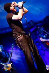
Haven't shot at Stubbs before but it was a fantastic experience. There's a really narrow pit right in front of the stage, between the crowd and performers - where the security normally are. I had a photo pass for the event which lets me in there. So before each band I had to push my way through the crowd and squeeze into that pit. I'd then get to shoot for the first 3 songs then get thrown out until the next band came on. It is such an intense way to shoot - what a rush. You are crouched down there, with thousands of people behind you, the music is deafening, even with earplugs on then the band comes on stage and the crowd is even louder than the music. The adrenaline kicks in and you start to shoot. They launch into the set and you are shooting like mad, trying to focus in the low light, trying to expose correctly in the wildly changing light, trying to track and compose on the constantly moving performers. Shoot, compose, move, check exposure, shoot, focus, shoot some more. All the time trying to keep low, not get in view, keep out of the way, not trip over a cable. I've shot a few venues other than Stubbs and usually it is a real struggle to get enough light to even get anything sharp. This time around the light show was excellent, really bright and I was able to shoot around ISO800 and still get 1/125s exposures. Focusing and metering are still a fun challenge but at least there was a chance this time! Then it's all over the bouncers are telling you to get out and you calm down, review some of the shots and get ready to do it all again. Great fun.

Friday, February 23, 2007

Video out

helen

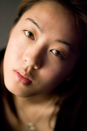
Shot at a recent portrait class. The lighting was really simple, 2 sets of Target floor lamps. Each lamp has 3 adjustable 100W bulbs that can be moved around/ pointed in different directions. In this case, they were all pointing through a 1m square diffusion panel, about 3 inches to the left of the frame (i.e., really close to her face) Total cost of the lighting equipment is around $60. She is sitting on the floor, looking up towards me while I stand on a small chair and shoot down towards her, giving the really great fall off from the shallow depth of field of the lens and her body angle. Was also interesting because I was shooting tethered to get a quick and large view of the shots I was taking. However, I wasn't tethered to a laptop, with the associated slight download delay, my camera was plugged directly into a digital projector, via the video out. You can do the same thing with a TV - essentially the LCD display on the rear of the camera appears on the projected screen or TV display and you can use all the normal menus, review and zooming that you could on the LCD, except it is 16ftx20ft in size. This can really help the subject see what you are doing or trying to achieve - so can be very helpful - as long as you are getting good shots! ISO800, 1/160s at f1.8, 85mm f1.8 on a Canon 1dII

Monday, February 19, 2007

Making a splash
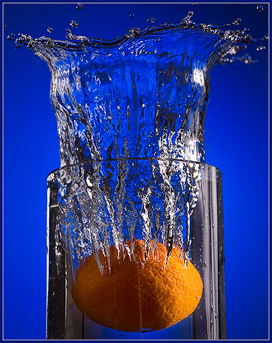
Blue, with a splash of orangeA slight departure from the portraiture I've been doing recently, but still a chance to experiment with some off-camera lighting. These kinds of stop motion splash photographs always looked like a lot of fun and a recent dpchallenge theme of fruit & veg seemed like a good opportunity to make a mess.
The lighting is summarised in the diagram below. The main light was one flash, on the camera right in an umbrella, just slightly behind the glass. I've found when lighting glass that you really want the light coming through it from behind. Any front light appears as reflections and hotspots on the glass. Backlight just flatters glass a whole lot more. I moved the umbrella to close to 90 degrees to the camera, but just a bit further beyond, from the camera perspective. I've still got hotspots and light reflections in the water, but nothing much on the glass, which is what I wanted. The background is a white wall, with a blue gel on the strobe, hitting it at about 1/8th power. The flash is zoomed as tight as possible, then moved relative to the camera to give a natural vignette to the frame of the camera. I shot a few test frames to dial in the power that I wanted at the shutter speed I was going for. The shutter speed was set at 1/250s and the aperture was f7.1 to give some depth of field and keep the lens sharp. I'd started at f8 but moved to adjust the flash output. I bumped the ISO up to 400 to get reasonable exposures with the flash - just eyeballing it all on the histogram, prior to starting to drop the orange into the water. I picked blue for the background, to play off the complimentary colour relationships with the orange. I also pushed the ISO so that I could shoot the flashes at less than full power. The lower the flash power, the shorter the flash pulse and the more motion stopping happens. If the flash was on full power, I'd get a much brighter flash but also a longer pulse, which would mean the water wouldn't be as crisp. Because the main light was in an umbrella, pointing back towards the camera, flare was a concern. I put a gobo ( short for go between) between the camera and the flash to control this (black card attached to the tripod with a plamp). I added a reflector low and camera left to bounce some fill (you can see the effect on the lesser highlight on the left of the orange). That's pretty much it for the lighting. I shot a few frames to check the exposure on the histogram. The biggest challenge was to stop the main light washing out the background - this was fixed with some tweaking of the umbrella placement. The flashes were triggered with pocket wizards, camera on tripod, triggered with a remote cable, so I could drop the fruit and trigger the camera at the same time. I took about 10 shots, went and reviewed them on the computer then shot another 10 to get the final result. It was interesting to note the effect on the water by dropping the orange into different shaped vessels - this one is so straight up and down and the water ends up that way too. I tried some shots with a more open vase (like a martini glass shape). The water splash went much wider and not as high. I also tried a more closed, tulip shape glass, which gave a different splash shape again. Also the water level has a effect too - if the vase is really full or not. More water made a more dramatic splash obviously, but it also affects the direction and shape of the frozen splash. I had a large plate under the vase to catch/ recycle some of the water, which I poured back into a jug and into the vase for each take. The garage dried out a couple of days later. Post processing was pretty minimal. Some adjustment on the colours of the orange to make it more vibrant and I cleaned up some spots of water that weren't adding much to the composition, because they were out of focus or just in places I didn't like. I also overlaid a second version of the shot, adjusted to keep the highlights in check and dropped that in on top, with a mask made by selecting just the highlights (Ctrl+Alt+~). That mask got blurred a bit and then I dropped the opacity down, all just to give some slight texture to the potentially blown out highlights in the water. They are still blown out, but now with a bit more control.

Wednesday, February 14, 2007

Valentine's Day

Valentine's Day

Happy Valentine's day, Amanda. I love you more each and every day.

Tuesday, February 13, 2007

Hobgoblins & Consistency
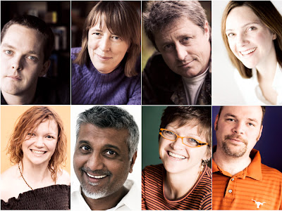
I've been attending a portrait class at AMOA for a couple of weeks now. So far it has been good for me, to push me to really think about lighting and how to work with a subject. Mainly though, it has been a way to carve out 3 hours a week to think about portraiture and photography. The instructor is great with some really inspiring portraits of his own, but what I really enjoy about these sorts of things is to be able to see and share images with a wide range of different photographers. The levels of experience and areas of interest are all over the place so it is great to see what people are doing and discuss and share process and ideas.
Last night we all put up three portraits from a series that we are working on. I used some of the images from my friends project. I'd shown one image on its own last week and the colour processing stood out from everyone else's work as somewhat different or odd. But when I put them together, the consistent treatment starts to work and my images pull together. After we talked about those three for a bit of time, I put the rest of the images up there - suddenly I could see that two stood out as not the right colour palette. Something was wrong - they didn't fit. What was interesting was I'd never seen that before - I think because I haven't yet put them out and really looked at them together.
Although I've been shooting this series in available light, the light that's available isn't always the same(*). Even though I've been applying the same set of colour manipulations to the images, the end results don't always tone in the same way - there's a couple that were shot outdoors that stood out as different and I think I'll need to re-work to fit in with the theme. I've been using the same focal length lens and roughly the same f-stop, but in a couple of cases I'm further away from the subject and that also stood out, side by side. On their own, they look perfectly okay, but as part of a consistent collection, the difference is clear. It is strange to realise how good your eye is at seeing the difference between colours - rather than seeing the absolute colours. Someone else had one picture printed at three different white balance settings. Each in isolation looked fine - the colour differences just were not very apparent - but when all three were shown side by side it really jumped out at you and only one looked right.
It was also instructive to note the effect of camera position, relative to the subjects in my portraits. The difference in camera height to subject height really changed the feel of the shots. Really subtle changes in where the eye level to camera level is changes the mood of the shots quite dramatically. The same with just where the person's head is, relative to the frame. Again this only really became visible to me when I started looking at the images side by side, so that I could compare the results.
I recently bought a metal rail for my office - I stick the prints up there to view them, so that they are in front of me more often. That way I can see them and they aren't hidden away in a box or on a hard drive. But I still hadn't confronted the images in the way I did last night. Taking the time to really look at them has given me new ideas on how to proceed - what needs to change, what's working and what needs to be adjusted. But what was good was how much they did all hang together and look like a consistent body of images. So I'm doing some things right and have some ideas to work out.
*There's an Arnold Newman quote where he was asked if he used available light and he replied 'yes, any light that's available'. I seem to be falling in to that mode.

Friday, February 09, 2007

Trey

Trey

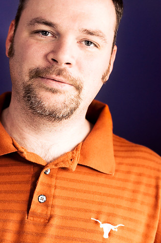
Nedra's husband, Trey - again. This is the shot that is part of the natural light portrait project. I wanted to use this room for the really deep purple walls. I opened up the shutters on the window (to the camera right) and got Trey to stand fairly close to it, so the light would fall across his face. The wall was further back in the shade so went even darker. Again I liked the complimentary colours of the purple and orange. I composed this one with the Longhorns logo in it, which I find gives interesting repetition. The shape repeats in the logo, the shape of the shirt collar/buttons and also his eyes & nose are at a similar angle, so the T shape repeating through the frame at different scales ties the elements together.

Tuesday, February 06, 2007

Visual language

Cross

A recent lenswork podcast brought to mind the idea of visual language and how we read photographs. Brooks expresses an interest in information theory but really seems to be considering the shared components of visual language. The visual words & phrases we all perhaps instinctively understand - a smile, crying.
For me, the key concept in information theory has been the measure of surprise, or entropy in a message. The canonical example is the two sentences, 'dog bites man' and 'man bites dog'. The second sentence is more surprising, even though it has the same words and number of letters as the first case. But if they were newspaper headlines, the second would grab your attention - it carries more information because it has more surprise. As a result it has higher entropy in an information theoretic sense of the term. This might be analogous to the difference between images with high initial impact and those that are quieter. Lots of colour, contrast, dramatic light and unusual subjects tend to characterise images with high impact and lots of visual surprise or entropy. Calmer palettes and light might lead to less surprising content. However, what interests me more is visual language and when applied to photography, two aspects. How to read & how to write visually. First I'd like to learn how people read images. I've heard mention that Westerners read photographs in the same way we read normally. Starting at the top left and working our way back and forth to the bottom right. If that's true - how can we use it ? Basic guidelines talk about rule of thirds and power points on those intersections - but if we scan a picture from top left to bottom right, does it then mean that each of those 4 places on a picture have different impact ? I think so. You can see that this is true by flipping rotating and mirroring images and notice how it changes the feel of them. This idea also can help with the placement of leading lines or other compositional elements, to change the way the picture is scanned. Other features such as the brightest area of the image or areas of highest contrast will also grab our eye, just like a surprising headline will make your eye jump ahead. So if Western cultures read images the same way that we read text, is that also true for other cultures that read top to bottom, or right to left ? Are images and composition significantly or subtly different in those cultures as a result ? Is the way we scan an image something more instinctual than that, or really driven by our education ? Secondly, knowing about these concepts and incorporating them consciously into your images can really improve the overall feel. Eventually it becomes more of an unconscious act that becomes part of your visual way of writing. I'd love to learn more about the way we scan or read images so if anyone has good pointers or references, please leave me a comment. But that just touches on the layout on the page. What you are saying is equally or more important than how you say it. There are certainly some universal visual phrases that you can use - sunsets, a smile, a baby crying. Everyone that looks at the picture understands those symbols straight away. But there are also more complex phrases, that are culturally relevant. These become harder to read if you aren't part of that culture. As an example, consider the use of colour. Red in some cultures for weddings, white in others. Or red for Communism. Black & orange symbolise Hallowe'en. In China, white is considered the colour associated with funerals. White hooded robes in some cultures are a sign of hatred, in others the robes of very religious, pious men. A cross. A flag. All powerful short-hand for specific ideas. Using these stronger symbols can be very open to subjective interpretation - the viewer may well see and understand things in a very different way to the photographer. Brooks mentioned Robert Franks series 'The Americans'. I checked that book out of the library a couple of years ago and was singularly unimpressed. The images didn't mean much to me. Didn't make much sense - I couldn't understand all the praise heaped on that collection. It wasn't until a few weeks ago, while listening to a Jeff Curto lecture, where he described one of the images, that I started to understand the symbols and perhaps the power and significance of Franks other images. There is one image, in a diner, with a blown out window, a TV on, and nobody in the room. Curto describes the cultural fear of a nuclear holocaust, symbolised in the white window. He also explains that the TV is showing a famous at the time TV evangelist. Symbolising the preaching of religion and morals in the US - but nobody is listening. All of these symbols and ideas encapsulated in that image, but none of them registered with me. I didn't understand the nuclear zeitgeist or recognise the symbolic preacher. So the picture passed right over my head. Symbols are powerful phrases in photography, but only when they connect with the viewer who gets what you are saying. I also wonder if there is a visual equivalent to sentence construction. Some languages such as German tend to have the verb at the end. English has a different structure. Is this sort of re-arranging of the phrases and basic building blocks present in visual language too ? More importantly, can these ideas be used to change how you compose a picture to give more or less impact and in the end, to communicate ideas more effectively ? To do that, there's perhaps the even harder first step of working out what you want to say - what does the subject or scene in front of you make you feel and want to communicate ? Only then can you start thinking about how you want to say it.

Monday, February 05, 2007

Nedra

Nedra

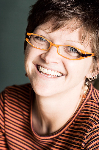
Nedra is a good friend of mine who I met through training for a triathlon a few years ago. She is an exceptional runner and recently qualified for the Boston marathon. There is no way I can keep up with her! This shot was taken in her home. The room is painted a really subtle green which I wanted to use to compliment her orange/ purple top. That top also played well on her signature glasses. I've recently been paying more attention to some of the ideas from colour theory and looking for complimentary colours, or close to complimentary colours to play on in my photography. Here the green/teal and orange are close to opposites and work well. The lighting is really simple, just window light behind me, to the camera rear/right. We set up and just talked a bit and shot several frames. Nedra even took her turn playing with my camera and shooting me, to get a feel for what I was seeing. Between that and showing her some of the results on the back of the camera, I think I managed to break the ice and give her a better idea of what I was trying to achieve. Post processed with the same partial desaturation and dodge/ burn that I've been working with for all of the portraits in this project. I've printed them all out and they are really starting to hang together thematically and visually. I'm also finding that the commitment to shooting in a similar style and subject over and over is really helping me to learn more about what I'm trying to do and how to improve each time.

Only in Texas

Lone Star

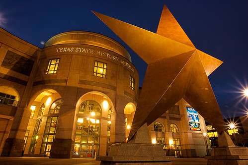
This shot was a high dynamic range composite of three exposures, taken about two thirds of a stop apart. It is the Texas state history museum at twilight. I've been wanting to shoot this for a while now and felt that twilight would be the perfect time, to get that deep blue sky colour. I pushed it a bit further to get a really strong complimentary colour relationship to the orange star and deep blue sky that I think makes for a much more dramatic scene than if the sky was totally black. I found that you just have to be there at the right time to get shots like this - and the right time doesn't last very long. Ten minutes earlier than this and the sky was too light, ten minutes later and the magic was gone. The sky was black and while it still works, the result just isn't as effective. Low angle, on a tripod, Canon 17-40mm F4L at the 17mm end and stopped down quite far to get the point light sources to give that characteristic small aperture star pattern. This subject is one of those I want to capture for my Iconic Austin series. I'm beginning to question the idea of shooting all of this project with a lensbaby. I might have to revise how I'm approaching this, or expand into an Austin at Night side project.

Sunday, February 04, 2007

Trey

Trey

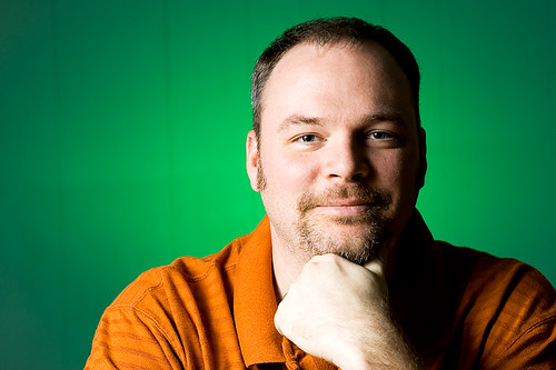
I've been continuing with my friends photo project and managed to spend a couple of hours with Nedra & Trey at their house. We took a few shots that fit into the theme of the project, that I'll post later in the week. I also picked on them to help me out with some more elaborate lighting setups and this is one of those. The lighting isn't particularly difficult really but still a whole lot more than I'm used to doing. The whole setup for this took about 10 minutes, eyeballing it with the histogram on the camera. I used Amanda as a stand-in to get the lighting dialed in and then took just 8 shots of Trey to get something that I was happy with. I actually have about 5 good shots out of that 8 so it pays to have everything set up before hand! I really saw the value of having the light worked out before you bring the actual subject in with this. Before Trey was there, I was fussing around, moving lights, changing settings, but when he came in I was ready to go. The whole shoot from his perspective took about 2 minutes so he wasn't getting bored or fed up with the flashing strobe. Well worth spending the time up front to get good and painless results. Green wall behind him, hit with a green gelled flash on a stand down behind his back (SB-28 at about 1/8th power, zoomed to as narrow as possible. Main light: canon 580 EX to camera left & up into an umbrella at about 1/2 power, 4 feet away. Both strobes triggered with pocket wizards. 1/250s @ f5.6 ISO 100