
Some evolution of the original ideas. Not convinced about the placement of my name on the cover yet. Inspiration struck when I realised that all of the interior pages don't have to be laid out exactly the same way. Something of a
D'oh moment, that one.
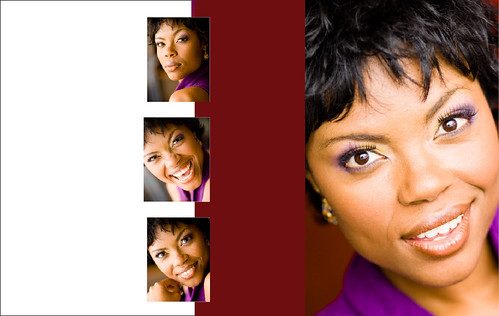
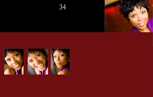
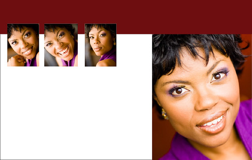
I also decided to pick a single colour to use for some graphic elements in the page layouts and throughout the book. Fonts still need some attention - they haven't had any yet. Oh and the pictures of course, too! I know these are all the same photos over and over again - I'm trying to keep some of the shots as a surprise, so all the images are just placeholders for now.
Did work out the export settings to form a web PDF of the book and it is looking okay. The
spread vs
pages options in InDesign export help hold things together in a pdf with two pages per page, or single pages.


6 comments:
This may sound extremely superficial, but... I think you should pick a better looking person for your cover. I'm not saying a bikini clad model, but you also shouldn't go with this guy who looks like the math teacher we all hated. He also looks like he's about to cry.
Just sayin'.
Thanks Mike,
It's a fair point :) All of the pictures are going to change, for now they are just placeholders in the layouts
i still think the title line is too busy. . .adding your name below it makes it even more so.
Mike! I have to stick up for Kirk, the guy on the cover, whether or not he is going to be there. He is an amazing photographer and a really nice guy. Personally, I think it is a great portrait.
Gordon,
I was going to suggest that you rename your book to simple "Expressions"
It makes the front look less busy, and I think it works/sounds better than "Photo Expressions"
FWIW. :)
Amanda!
I don't doubt that he's a great guy! I just think he looks like he's about to cry, and he reminds me of my math teacher I hated.
;)
Post a Comment